01BeginnerCombo Chart
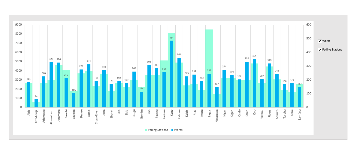
Two scales, one plot area
01Beginner
Combo Chart
Two scales, one plot area
A combo chart overlays two different chart types on the same plot area — most commonly a column chart and a line chart — each mapped to its own axis. It solves one of the most common dashboard problems: showing two datasets that live on fundamentally different scales in the same visual space.
Where it earns its place
- Revenue and margin dashboard · Finance & Accounting
- Sales and headcount reporting · Sales & Revenue
- Inventory and demand planning · Supply Chain & Operations
- Budget vs actuals reporting · Finance & Accounting
- Customer acquisition and churn · Marketing & Growth
Complexity scorecard
Features
Formatting
Formulas
Controls
Time
Build steps in the guide
- 01Insert a clustered column chart
- 02Change one series to a line
- 03Set the line series to Line
- 04Send the line to a secondary axis
- 05Calibrate axes and clean up formatting
Pro tip · Set the secondary axis maximum to roughly double your line's peak value. It keeps the line clear of the columns instead of cutting through them.
VBA required: No. Built entirely with native Excel chart tools.