Beyond the
Bar Chart.
11 underused chart types that transform how your dashboards, models and reports communicate.
Excel shows the data, but it doesn't always show the story.
A bar chart is honest. A pie chart is familiar. But familiar is not the same as effective – and in a world where your audience is overloaded, a chart that is merely accurate is not enough. It needs to stop the scroll, demand attention, and make the insight impossible to miss.
The good news is that Excel – the tool already sitting on every desk in your organisation – is hiding one of the most powerful data visualisation toolkits in the world. Right there, beneath the surface of Insert → Charts.
This guide is your invitation to find it.
charts
charts
charts
How to read this guide
This page covers the compatibility and complexity of each chart – two things worth knowing before you build. Compatibility tells you where a chart survives; complexity tells you what it will cost you to build it.
Every overview page carries a compatibility table that answers one question per row: if I build this chart and someone opens it there, what do they see?
The chart type is native here. You can build it, edit it, and it renders exactly as designed. Nothing in the build steps needs changing for this platform.
It renders view-only with no editing, a setting that sometimes drops on transfer, or a dependency on a font or feature that may not be present. Open it on the platform and check it.
The chart does not survive. The platform has no equivalent, so it falls back to a different chart type, or the feature is unavailable outright. Rebuild it natively there, or keep the file in Excel.
Every chart is scored on the same five dimensions, and each star has a written definition behind it. The band below is the shape of the build overall.
| Dimension | |||
|---|---|---|---|
| Features neededHow much of Excel's chart engine the build reaches for. | One native chart type, inserted and used as it comes | A native type plus a second feature - secondary axis, combo series or conditional formatting | Two or more chart objects or features layered into a single visual |
| Formatting effortHow much of the finished look you have to set by hand. | Excel's defaults land close to final; light tidying only | Axes, colours, gap widths and labels all need setting deliberately | Pixel-level work - cell sizing, transparent fills, rotation or manual overlays |
| Formulas neededHow much calculation sits behind the chart. | Charts directly off the source range; no helper cells | One helper column derived from the source data | A helper table with conditional, cumulative or lookup logic feeding the series |
| Form controlsWhether the reader drives the chart from the sheet. | None - the chart is static once it is built | One optional control, added for convenience rather than function | Linked Form Controls and cell links are core to how the chart works |
| Time to developFirst build, blank sheet to finished chart. | Under 10 minutes | 10 to 30 minutes | 30 minutes or more - worth saving as a reusable template |
What this guide covers
The use cases are not illustrations. Each one is a report someone actually runs, drawn from the functions below, and each chart is scoped against five of them.
Every use case on an overview page carries the colour of the function that owns it, and each page prints the key for the functions it draws on. The count is how many of the 55 use cases belong to that function.
Every chart carries a short list of things that will bite you. They are not reasons to avoid a chart – they are the decisions Excel leaves to you. All of them fall into six families.
Combo Chart
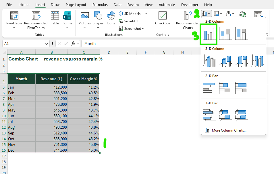
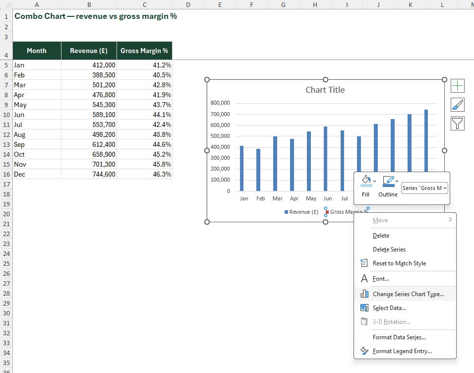
A combo chart overlays two different chart types on the same plot area – most commonly a column chart and a line chart – each mapped to its own axis. It solves one of the most common dashboard problems: showing two datasets that live on fundamentally different scales in the same visual space.
| Platform | Support | Note |
|---|---|---|
| Excel Desktop (2016+) | Full | native chart type |
| Excel Mobile | Partial | no editing capability |
| Excel Web | Full | browser rendering accurate |
| Google Sheets import | Partial | combo renders but secondary axis sometimes drops; verify on import |
Combo Chart
Select your two data series and insert a clustered column chart
Click on the series you want as a line → right-click → "Change Series Chart Type"
In the dialog, set Series 2 to Line
Check "Secondary Axis" for the line series
Format both axes – adjust scale min/max so both series display cleanly; then remove excess gridlines, format the line with a contrasting colour, and add data labels selectively
Combo Chart
Select your two data series and insert a clustered column chart
Click on the series you want as a line → right-click → "Change Series Chart Type"
In the dialog, set Series 2 to Line
Check "Secondary Axis" for the line series
Format both axes – adjust scale min/max so both series display cleanly; then remove excess gridlines, format the line with a contrasting colour, and add data labels selectively
Combo Chart
Select your two data series and insert a clustered column chart
Click on the series you want as a line → right-click → "Change Series Chart Type"
In the dialog, set Series 2 to Line
Check "Secondary Axis" for the line series
Format both axes – adjust scale min/max so both series display cleanly; then remove excess gridlines, format the line with a contrasting colour, and add data labels selectively

Combo Chart
Select your two data series and insert a clustered column chart
Click on the series you want as a line → right-click → "Change Series Chart Type"
In the dialog, set Series 2 to Line
Check "Secondary Axis" for the line series
Format both axes – adjust scale min/max so both series display cleanly; then remove excess gridlines, format the line with a contrasting colour, and add data labels selectively

Combo Chart
Select your two data series and insert a clustered column chart
Click on the series you want as a line → right-click → "Change Series Chart Type"
In the dialog, set Series 2 to Line
Check "Secondary Axis" for the line series
Format both axes – adjust scale min/max so both series display cleanly; then remove excess gridlines, format the line with a contrasting colour, and add data labels selectively

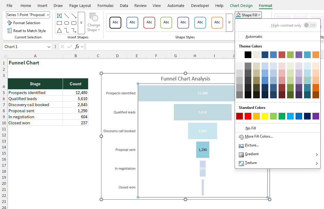
Funnel Chart
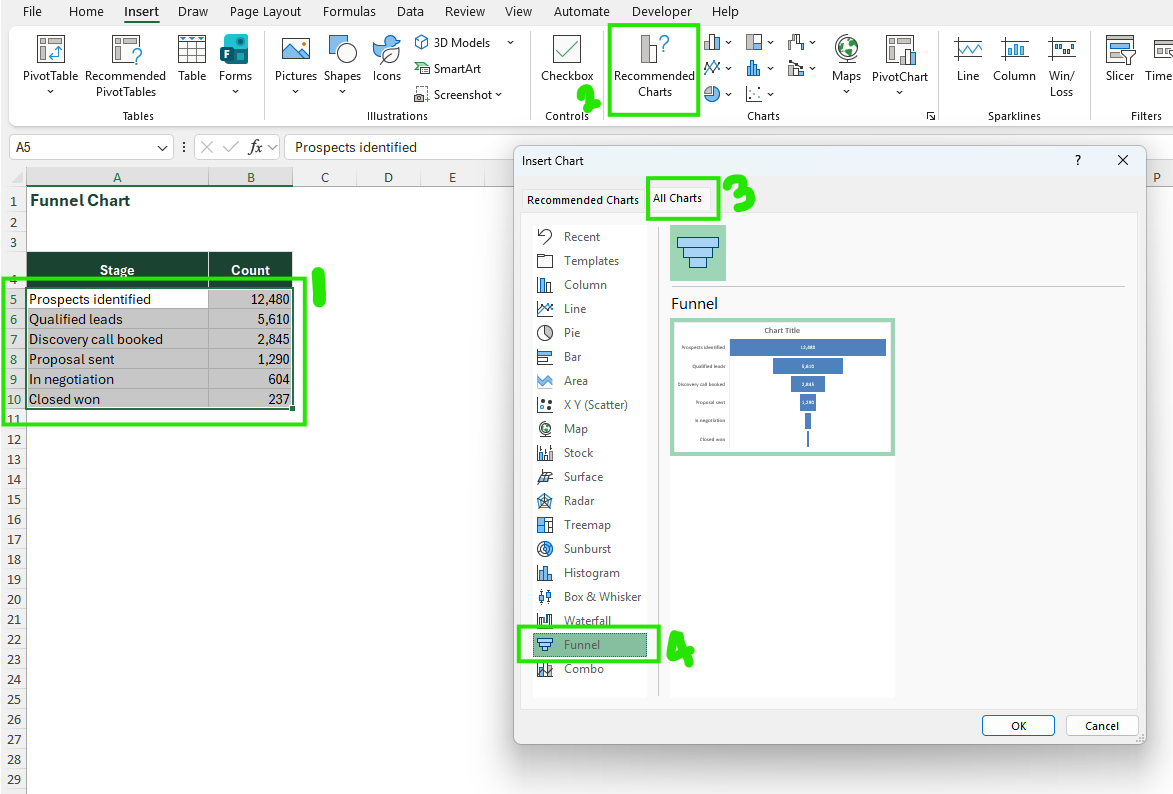
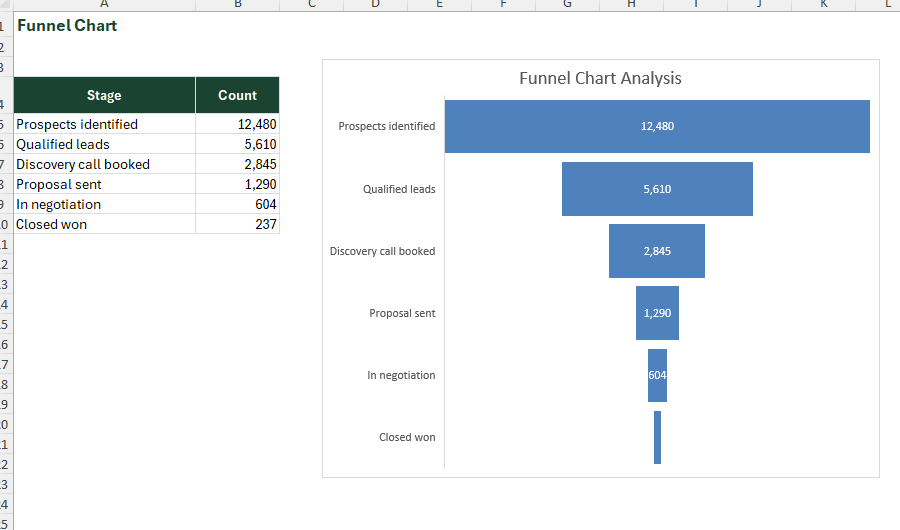
A funnel chart shows values progressively decreasing across sequential stages – visualising drop-off, conversion, or attrition through a process. Each bar is centred and narrower than the one above, creating a distinctive funnel silhouette that makes the relative size of each stage immediately legible.
| Platform | Support | Note |
|---|---|---|
| Excel Desktop (2019+) | Full | Full native support |
| Excel Desktop 2016 | Breaks | simulate with bar chart trick (centre-aligned bars) |
| Excel Mobile | Partial | View only |
| Excel Web | Full | Full support |
| Google Sheets import | Breaks | reverts to bar chart; rebuild natively in Sheets |
Funnel Chart
Select range → Insert → Charts → Funnel (available in Excel 2019+)
Format: remove legend, remove axis, increase gap width to 15–20%
Apply colour gradient from dark to light top-to-bottom to reinforce the narrowing narrative
Funnel Chart
Select range → Insert → Charts → Funnel (available in Excel 2019+)
Format: remove legend, remove axis, increase gap width to 15–20%
Apply colour gradient from dark to light top-to-bottom to reinforce the narrowing narrative
Funnel Chart
Select range → Insert → Charts → Funnel (available in Excel 2019+)
Format: remove legend, remove axis, increase gap width to 15–20%
Apply colour gradient from dark to light top-to-bottom to reinforce the narrowing narrative
In-Cell Chart
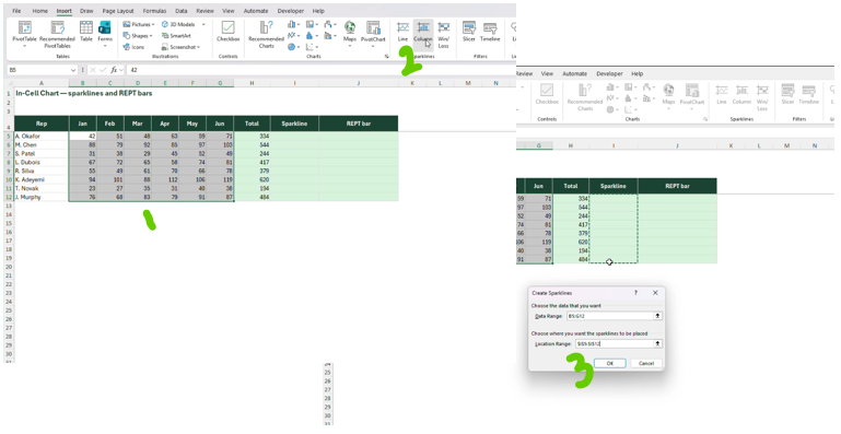
In-cell charts are micro-visualisations that live inside spreadsheet cells rather than as separate chart objects. They take two forms: Excel's native Sparklines (miniature line, bar or win/loss charts embedded in a cell), and REPT-function bar charts (a formula-driven technique that fills a cell with repeated characters scaled to a value). Both allow data tables to carry their own visual context without a separate chart object.
| Platform | Support | Note |
|---|---|---|
| Excel Desktop | Full | Full support for both Sparklines and REPT bars |
| Excel Mobile | Partial | may render inconsistently depending on font |
| Excel Web | Partial | Sparklines display correctly; REPT bars work if the Wingdings/Courier font renders |
| Google Sheets import | Breaks | recreate using Sheets' native SPARKLINE function; REPT bars import as text only |
In-Cell Chart
For Sparklines: Select a blank cell beside your data row → Insert → Sparklines → Line (or Column/Win-Loss) → select data range → confirm
Customise via Sparkline Design tab: set high/low point colours, axis scale
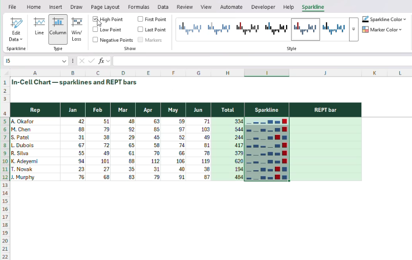
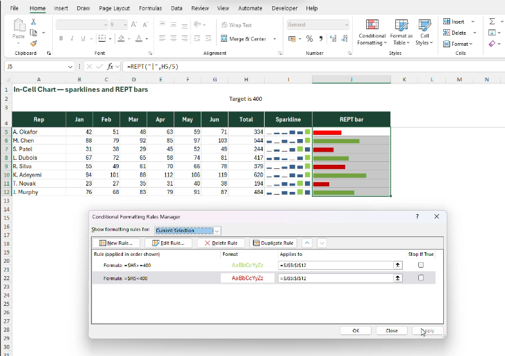
For REPT bars: In a new column enter =REPT("|",[TOTALVALUE]) and set that column's font to Playbill
Adjust the divisor to control the maximum bar length – e.g. =REPT("|",[TOTALVALUE]/5); this example uses a divisor of 5
Apply conditional formatting to colour-code bars by value band (e.g. green above target, red below)
In-Cell Chart
For Sparklines: Select a blank cell beside your data row → Insert → Sparklines → Line (or Column/Win-Loss) → select data range → confirm
Customise via Sparkline Design tab: set high/low point colours, axis scale
For REPT bars: In a new column enter =REPT("|",[TOTALVALUE]) and set that column's font to Playbill
Adjust the divisor to control the maximum bar length – e.g. =REPT("|",[TOTALVALUE]/5); this example uses a divisor of 5
Apply conditional formatting to colour-code bars by value band (e.g. green above target, red below)
In-Cell Chart
For Sparklines: Select a blank cell beside your data row → Insert → Sparklines → Line (or Column/Win-Loss) → select data range → confirm
Customise via Sparkline Design tab: set high/low point colours, axis scale
For REPT bars: In a new column enter =REPT("|",[TOTALVALUE]) and set that column's font to Playbill
Adjust the divisor to control the maximum bar length – e.g. =REPT("|",[TOTALVALUE]/5); this example uses a divisor of 5
Apply conditional formatting to colour-code bars by value band (e.g. green above target, red below)

In-Cell Chart
For Sparklines: Select a blank cell beside your data row → Insert → Sparklines → Line (or Column/Win-Loss) → select data range → confirm
Customise via Sparkline Design tab: set high/low point colours, axis scale
For REPT bars: In a new column enter =REPT("|",[TOTALVALUE]) and set that column's font to Playbill
Adjust the divisor to control the maximum bar length – e.g. =REPT("|",[TOTALVALUE]/5); this example uses a divisor of 5
Apply conditional formatting to colour-code bars by value band (e.g. green above target, red below)

In-Cell Chart
For Sparklines: Select a blank cell beside your data row → Insert → Sparklines → Line (or Column/Win-Loss) → select data range → confirm
Customise via Sparkline Design tab: set high/low point colours, axis scale
For REPT bars: In a new column enter =REPT("|",[TOTALVALUE]) and set that column's font to Playbill
Adjust the divisor to control the maximum bar length – e.g. =REPT("|",[TOTALVALUE]/5); this example uses a divisor of 5
Apply conditional formatting to colour-code bars by value band (e.g. green above target, red below)
Supplier Health Tracker
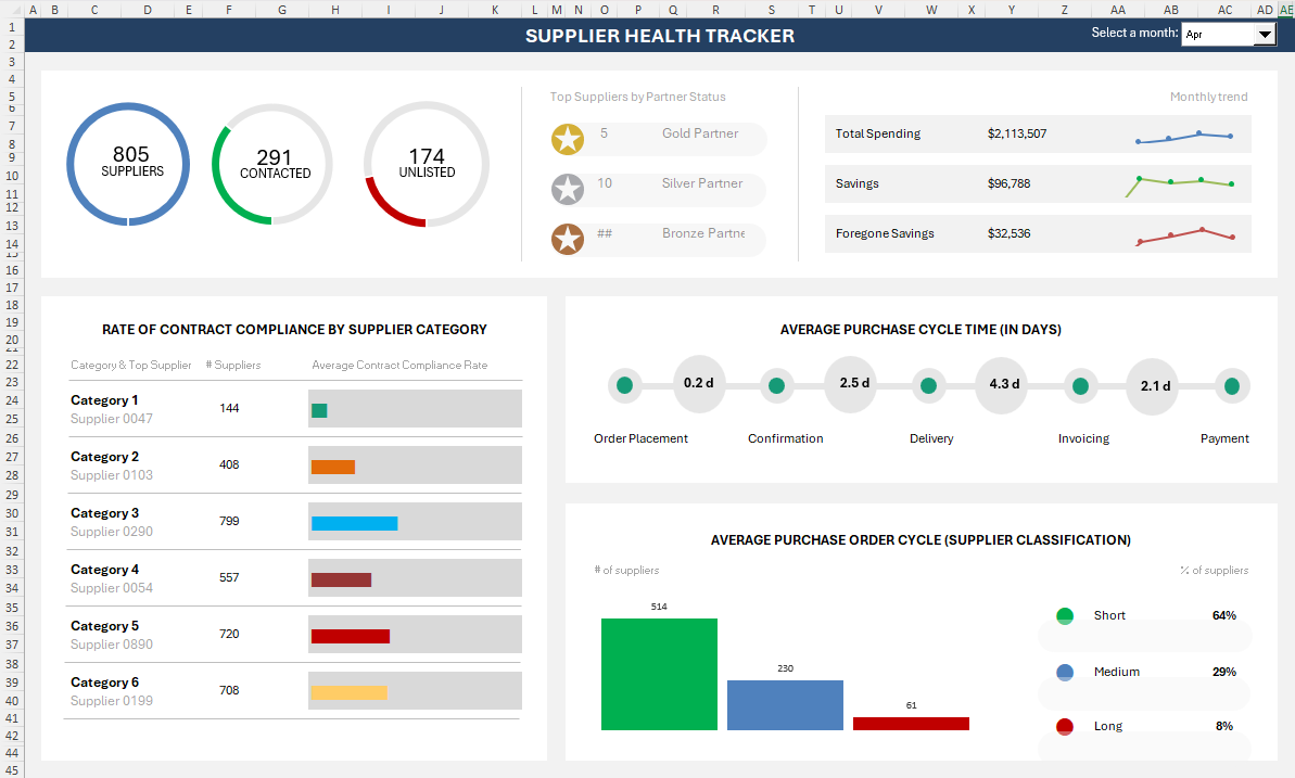
The compliance table in the bottom-left panel is built from the same REPT-bar technique this guide just walked through, sitting alongside sparkline trend cells and dial KPIs in one live dashboard.
Waterfall Chart
A waterfall chart visualises how an initial value is built up or broken down by a series of intermediate positive and negative contributions, arriving at a final total. Bars float at heights corresponding to cumulative running totals – each bar's top marks where the next bar begins – making the path from start to finish immediately readable. It is one of the most analytically powerful chart types in business reporting and one of the most underused.
| Platform | Support | Note |
|---|---|---|
| Excel Desktop 2016+ | Full | Full native support |
| Excel Desktop 2013 and below | Partial | Must simulate using stacked bar with invisible base series |
| Excel Mobile | Partial | View only |
| Excel Web | Full | Full support |
| Google Sheets import | Breaks | reverts to standard bar chart on import; no native waterfall in Sheets |
Waterfall Chart
Create a table: Column A = category names, Column B = values (+ve for increases, −ve for decreases), Column C = type (mark "Total" for first and last rows)
Select range → Insert → Charts → Waterfall
Right-click the first bar → "Set as Total"; repeat for the last bar and any subtotals
Format: remove gridlines

Waterfall Chart
Create a table: Column A = category names, Column B = values (+ve for increases, −ve for decreases), Column C = type (mark "Total" for first and last rows)
Select range → Insert → Charts → Waterfall
Right-click the first bar → "Set as Total"; repeat for the last bar and any subtotals
Format: remove gridlines

Waterfall Chart
Create a table: Column A = category names, Column B = values (+ve for increases, −ve for decreases), Column C = type (mark "Total" for first and last rows)
Select range → Insert → Charts → Waterfall
Right-click the first bar → "Set as Total"; repeat for the last bar and any subtotals
Format: remove gridlines

Waterfall Chart
Create a table: Column A = category names, Column B = values (+ve for increases, −ve for decreases), Column C = type (mark "Total" for first and last rows)
Select range → Insert → Charts → Waterfall
Right-click the first bar → "Set as Total"; repeat for the last bar and any subtotals
Format: remove gridlines

Gantt Chart
A Gantt chart is a horizontal bar chart where each bar represents a task or phase, positioned along a timeline. Its x-axis is time; its y-axis is a list of activities. Bars begin at the task start date and end at the task end date. Excel has no native Gantt chart type – it is built by combining a stacked bar chart with an invisible start-date series, producing one of Excel's most valued dashboard constructs.
| Platform | Support | Note |
|---|---|---|
| Excel Desktop | Full | built manually using stacked bar technique |
| Excel Mobile | Partial | View only |
| Excel Web | Full | renders correctly in browser |
| Google Sheets import | Breaks | The stacked bar structure imports but axis date formatting usually breaks; requires manual axis reconfiguration |
Gantt Chart
Create table: Task name, Start Date, Duration (days), Category. Enter dates as real Excel date values
Insert stacked bar chart using Start Date and Duration as two series
Select the Start Date series → Format Data Series → No Fill, No Border (makes it invisible – this is the spacer)
Set x-axis to date axis type; set minimum to your project start date as a number value; adjust major unit to 7 (weekly) or 30 (monthly)
Reverse y-axis order (Format Axis → Categories in reverse order) so tasks read top-to-bottom; add a "today" vertical line using a scatter series with error bars

Gantt Chart
Create table: Task name, Start Date, Duration (days), Category. Enter dates as real Excel date values
Insert stacked bar chart using Start Date and Duration as two series
Select the Start Date series → Format Data Series → No Fill, No Border (makes it invisible – this is the spacer)
Set x-axis to date axis type; set minimum to your project start date as a number value; adjust major unit to 7 (weekly) or 30 (monthly)
Reverse y-axis order (Format Axis → Categories in reverse order) so tasks read top-to-bottom; add a "today" vertical line using a scatter series with error bars

Gantt Chart
Create table: Task name, Start Date, Duration (days), Category. Enter dates as real Excel date values
Insert stacked bar chart using Start Date and Duration as two series
Select the Start Date series → Format Data Series → No Fill, No Border (makes it invisible – this is the spacer)
Set x-axis to date axis type; set minimum to your project start date as a number value; adjust major unit to 7 (weekly) or 30 (monthly)
Reverse y-axis order (Format Axis → Categories in reverse order) so tasks read top-to-bottom; add a "today" vertical line using a scatter series with error bars

Gantt Chart
Create table: Task name, Start Date, Duration (days), Category. Enter dates as real Excel date values
Insert stacked bar chart using Start Date and Duration as two series
Select the Start Date series → Format Data Series → No Fill, No Border (makes it invisible – this is the spacer)
Set x-axis to date axis type; set minimum to your project start date as a number value; adjust major unit to 7 (weekly) or 30 (monthly)
Reverse y-axis order (Format Axis → Categories in reverse order) so tasks read top-to-bottom; add a "today" vertical line using a scatter series with error bars

Gantt Chart
Create table: Task name, Start Date, Duration (days), Category. Enter dates as real Excel date values
Insert stacked bar chart using Start Date and Duration as two series
Select the Start Date series → Format Data Series → No Fill, No Border (makes it invisible – this is the spacer)
Set x-axis to date axis type; set minimum to your project start date as a number value; adjust major unit to 7 (weekly) or 30 (monthly)
Reverse y-axis order (Format Axis → Categories in reverse order) so tasks read top-to-bottom; add a "today" vertical line using a scatter series with error bars

Waffle Chart
A waffle chart is a 10×10 grid of equal squares where each square represents 1% of a total. Filled squares (typically coloured) show the actual percentage; unfilled squares show the remainder. It is a visually compelling alternative to a pie or donut chart for single-percentage KPIs – more precise, more readable, and significantly more striking in a dashboard layout.
| Platform | Support | Note |
|---|---|---|
| Excel Desktop | Full | built using conditional formatting on a 10×10 cell grid |
| Excel Mobile | Partial | Displays correctly if the file is pre-built; conditional formatting renders on mobile |
| Excel Web | Full | Full support |
| Google Sheets import | Partial | Cell structure imports but conditional formatting rules may need recreation |
Waffle Chart
In a 10×10 cell block, number each cell 1–100 left-to-right, bottom-to-top (so cell 1 is bottom-left, cell 100 is top-right). Use a formula: =(ROW($A$1)-ROW())*10 + COLUMN()-COLUMN($A$1)+1 adjusted for your grid position
Make all cells square: set row height = column width (approximately 20×20 points)
Apply conditional formatting: "Format cells where cell value <= [percentage_cell]*100" → fill with blue (#1E40AF)
Apply a second rule for the remainder: cell value > percentage → fill with light grey (#E0E0E0)
Add a percentage label in a merged cell below the grid

Waffle Chart
In a 10×10 cell block, number each cell 1–100 left-to-right, bottom-to-top (so cell 1 is bottom-left, cell 100 is top-right). Use a formula: =(ROW($A$1)-ROW())*10 + COLUMN()-COLUMN($A$1)+1 adjusted for your grid position
Make all cells square: set row height = column width (approximately 20×20 points)
Apply conditional formatting: "Format cells where cell value <= [percentage_cell]*100" → fill with blue (#1E40AF)
Apply a second rule for the remainder: cell value > percentage → fill with light grey (#E0E0E0)
Add a percentage label in a merged cell below the grid

Waffle Chart
In a 10×10 cell block, number each cell 1–100 left-to-right, bottom-to-top (so cell 1 is bottom-left, cell 100 is top-right). Use a formula: =(ROW($A$1)-ROW())*10 + COLUMN()-COLUMN($A$1)+1 adjusted for your grid position
Make all cells square: set row height = column width (approximately 20×20 points)
Apply conditional formatting: "Format cells where cell value <= [percentage_cell]*100" → fill with blue (#1E40AF)
Apply a second rule for the remainder: cell value > percentage → fill with light grey (#E0E0E0)
Add a percentage label in a merged cell below the grid

Waffle Chart
In a 10×10 cell block, number each cell 1–100 left-to-right, bottom-to-top (so cell 1 is bottom-left, cell 100 is top-right). Use a formula: =(ROW($A$1)-ROW())*10 + COLUMN()-COLUMN($A$1)+1 adjusted for your grid position
Make all cells square: set row height = column width (approximately 20×20 points)
Apply conditional formatting: "Format cells where cell value <= [percentage_cell]*100" → fill with blue (#1E40AF)
Apply a second rule for the remainder: cell value > percentage → fill with light grey (#E0E0E0)
Add a percentage label in a merged cell below the grid

Waffle Chart
In a 10×10 cell block, number each cell 1–100 left-to-right, bottom-to-top (so cell 1 is bottom-left, cell 100 is top-right). Use a formula: =(ROW($A$1)-ROW())*10 + COLUMN()-COLUMN($A$1)+1 adjusted for your grid position
Make all cells square: set row height = column width (approximately 20×20 points)
Apply conditional formatting: "Format cells where cell value <= [percentage_cell]*100" → fill with blue (#1E40AF)
Apply a second rule for the remainder: cell value > percentage → fill with light grey (#E0E0E0)
Add a percentage label in a merged cell below the grid

Butterfly Chart
A butterfly chart (also called a tornado chart or back-to-back bar chart) displays two datasets horizontally on either side of a central axis, with categories shared between them. Left bars extend leftward; right bars extend rightward. It excels at head-to-head comparisons – making differences and similarities across a shared category list instantly readable.
| Platform | Support | Note |
|---|---|---|
| Excel Desktop | Full | built using a bar chart with a reversed axis trick |
| Excel Mobile | Partial | View only |
| Excel Web | Full | Full support |
| Google Sheets import | Partial | Bar chart structure imports but axis reversal formatting may reset; requires manual fix |
Butterfly Chart
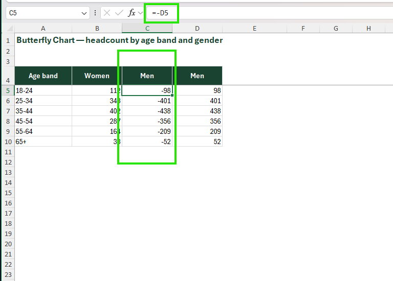
Structure data as three columns: Category, Left Series (as negative values or use axis reversal), Right Series (positive values)
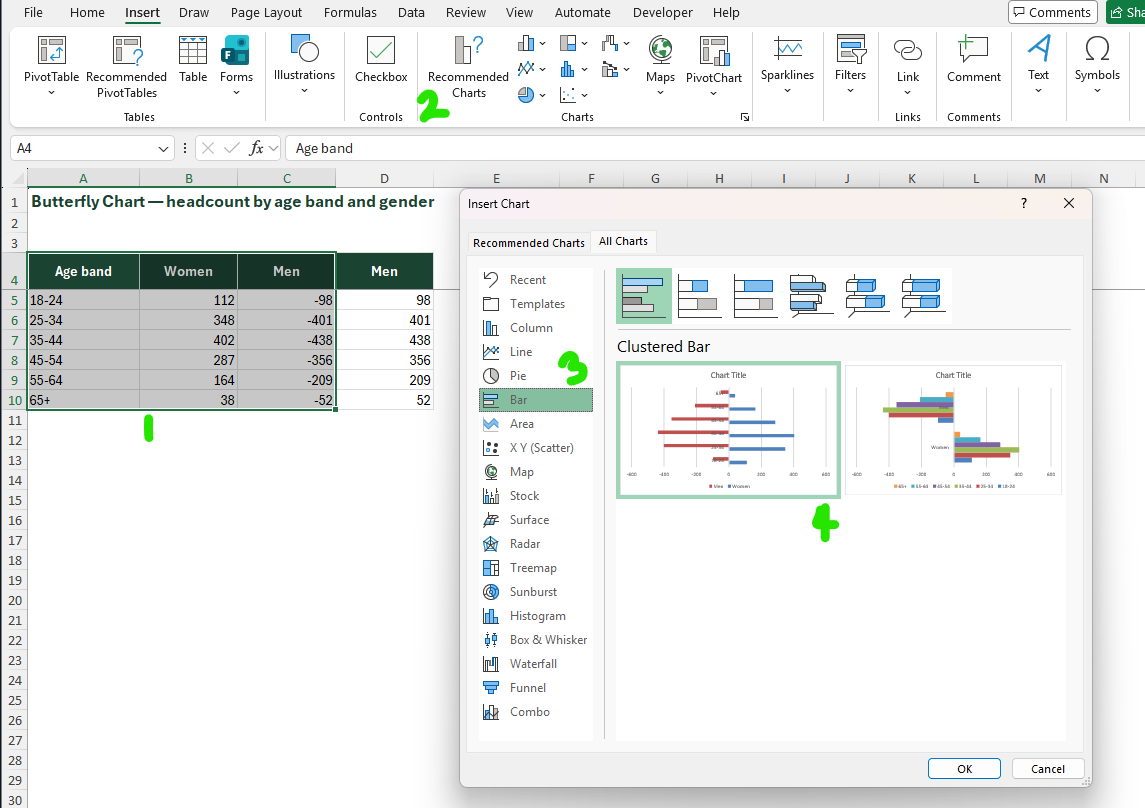
Insert a horizontal bar chart using both series
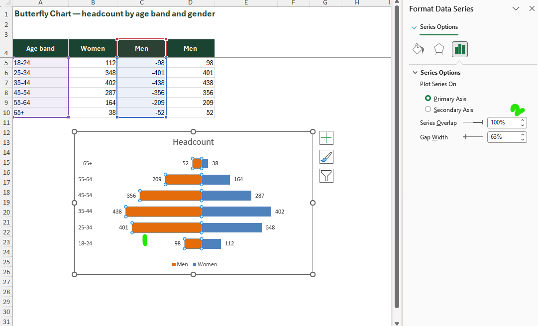
Select the left series bars → right-click → Format Data Series → Series Options → drag the Series Overlap slider to 100%
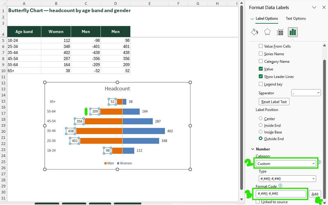
Apply a custom number format to the left series' values and labels: #,##0;#,##0 – this hides the minus sign so the negative values read as plain positive numbers
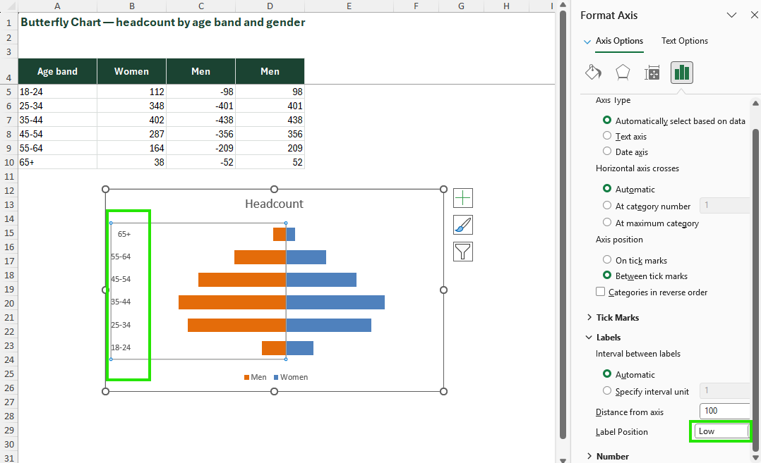
Position category labels at the centre: select the category axis → Format Axis → set Label Position to "Low" → move labels manually or use a third invisible series to float centre labels
Butterfly Chart
Structure data as three columns: Category, Left Series (as negative values or use axis reversal), Right Series (positive values)
Insert a horizontal bar chart using both series
Select the left series bars → right-click → Format Data Series → Series Options → drag the Series Overlap slider to 100%
Apply a custom number format to the left series' values and labels: #,##0;#,##0 – this hides the minus sign so the negative values read as plain positive numbers
Position category labels at the centre: select the category axis → Format Axis → set Label Position to "Low" → move labels manually or use a third invisible series to float centre labels
Butterfly Chart
Structure data as three columns: Category, Left Series (as negative values or use axis reversal), Right Series (positive values)
Insert a horizontal bar chart using both series
Select the left series bars → right-click → Format Data Series → Series Options → drag the Series Overlap slider to 100%
Apply a custom number format to the left series' values and labels: #,##0;#,##0 – this hides the minus sign so the negative values read as plain positive numbers
Position category labels at the centre: select the category axis → Format Axis → set Label Position to "Low" → move labels manually or use a third invisible series to float centre labels
Butterfly Chart
Structure data as three columns: Category, Left Series (as negative values or use axis reversal), Right Series (positive values)
Insert a horizontal bar chart using both series
Select the left series bars → right-click → Format Data Series → Series Options → drag the Series Overlap slider to 100%
Apply a custom number format to the left series' values and labels: #,##0;#,##0 – this hides the minus sign so the negative values read as plain positive numbers
Position category labels at the centre: select the category axis → Format Axis → set Label Position to "Low" → move labels manually or use a third invisible series to float centre labels
Butterfly Chart
Structure data as three columns: Category, Left Series (as negative values or use axis reversal), Right Series (positive values)
Insert a horizontal bar chart using both series
Select the left series bars → right-click → Format Data Series → Series Options → drag the Series Overlap slider to 100%
Apply a custom number format to the left series' values and labels: #,##0;#,##0 – this hides the minus sign so the negative values read as plain positive numbers
Position category labels at the centre: select the category axis → Format Axis → set Label Position to "Low" → move labels manually or use a third invisible series to float centre labels
Checkbox Chart
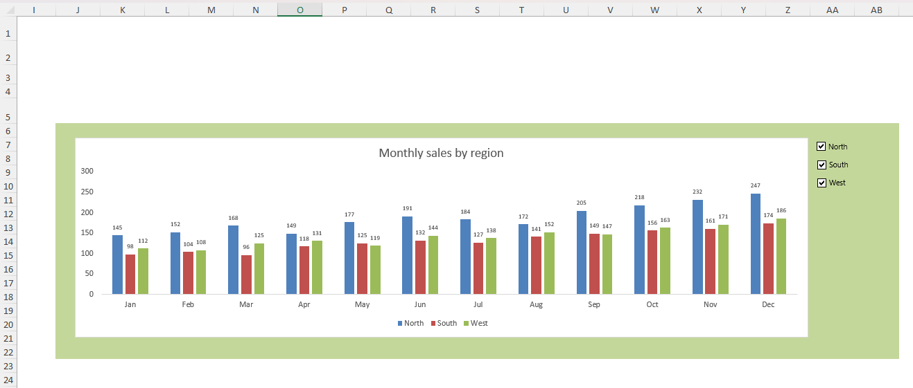
A checkbox chart is a standard chart (column, line, bar or other) connected to a set of Form Control checkboxes that show or hide individual data series dynamically. Checking a box makes a series visible; unchecking hides it. The result is an interactive dashboard element that allows users to control what they see without editing the underlying data – a powerful UX upgrade for shared reports and presentations.
| Platform | Support | Note |
|---|---|---|
| Excel Desktop | Full | Form Controls are a desktop-only feature |
| Excel Mobile | Partial | Chart displays but checkboxes are non-interactive on mobile |
| Excel Web | Partial | chart will display in its default state only |
| Google Sheets import | Breaks | entire interactive mechanism must be rebuilt |
Checkbox Chart
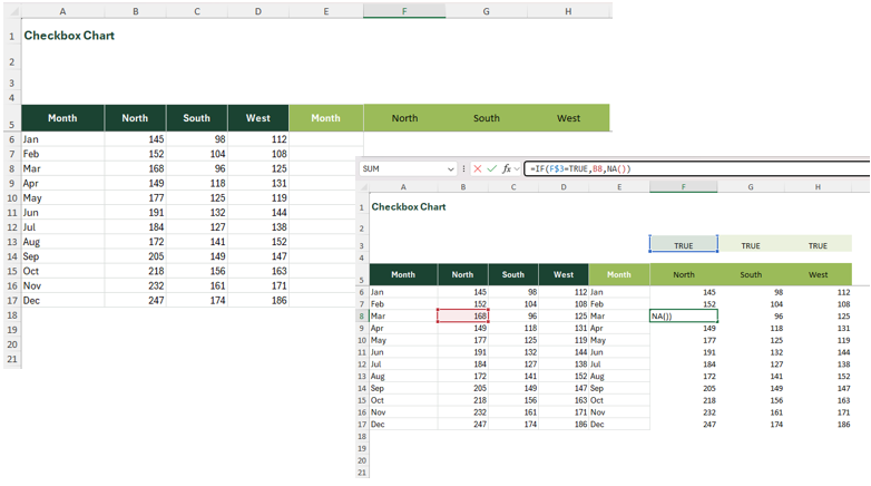
In your data prep area, create a helper table: for each series, write =IF(linked_cell=TRUE, actual_value, NA()) – NA() hides the series without removing it from the chart
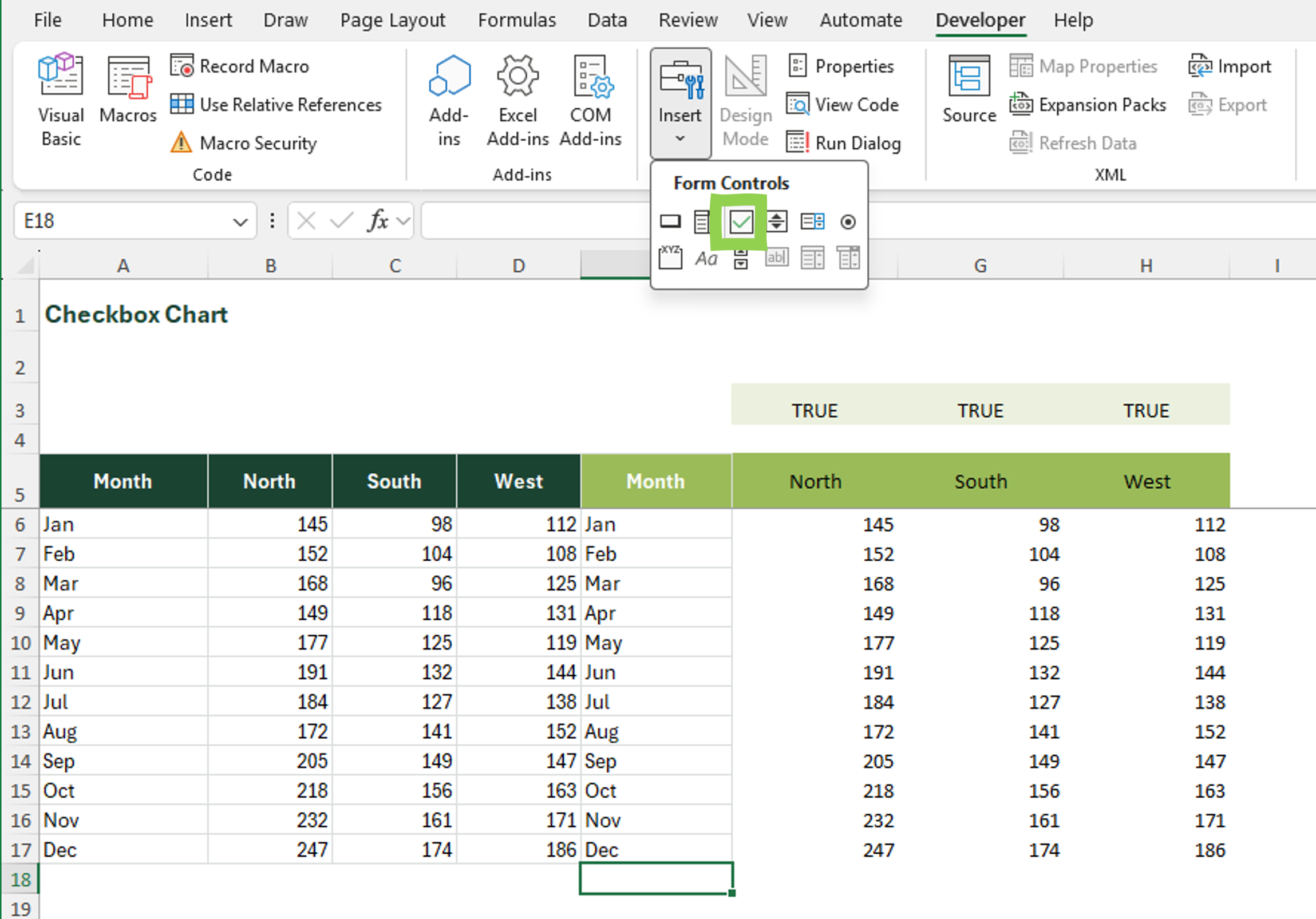
Insert → Form Controls → Checkbox; draw a checkbox near the chart
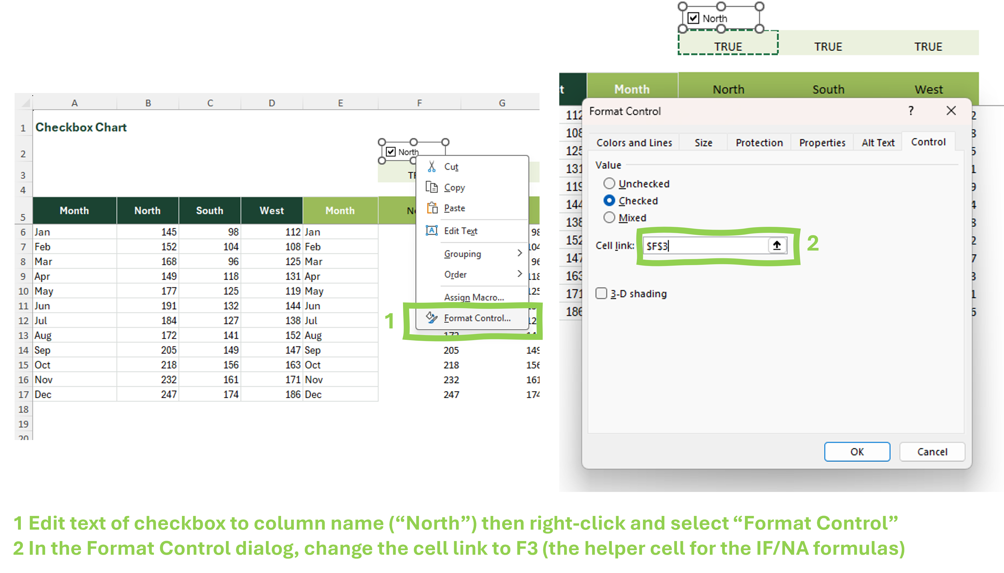
Right-click checkbox → Format Control → Cell link → select a blank cell (this cell will show TRUE/FALSE)
Build your chart using the helper table (not the raw data)
Repeat for each series; align and label checkboxes; lock the worksheet to prevent accidental edits to helper cells
Checkbox Chart
In your data prep area, create a helper table: for each series, write =IF(linked_cell=TRUE, actual_value, NA()) – NA() hides the series without removing it from the chart
Insert → Form Controls → Checkbox; draw a checkbox near the chart
Right-click checkbox → Format Control → Cell link → select a blank cell (this cell will show TRUE/FALSE)
Build your chart using the helper table (not the raw data)
Repeat for each series; align and label checkboxes; lock the worksheet to prevent accidental edits to helper cells
Checkbox Chart
In your data prep area, create a helper table: for each series, write =IF(linked_cell=TRUE, actual_value, NA()) – NA() hides the series without removing it from the chart
Insert → Form Controls → Checkbox; draw a checkbox near the chart
Right-click checkbox → Format Control → Cell link → select a blank cell (this cell will show TRUE/FALSE)
Build your chart using the helper table (not the raw data)
Repeat for each series; align and label checkboxes; lock the worksheet to prevent accidental edits to helper cells
Checkbox Chart
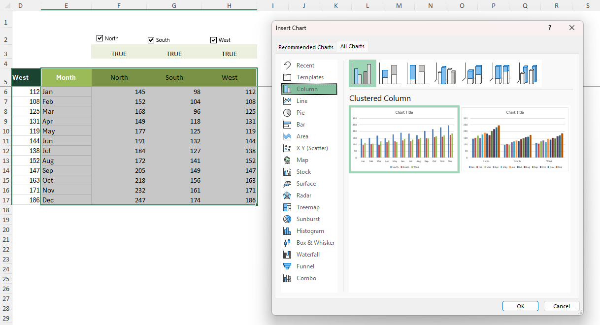
In your data prep area, create a helper table: for each series, write =IF(linked_cell=TRUE, actual_value, NA()) – NA() hides the series without removing it from the chart
Insert → Form Controls → Checkbox; draw a checkbox near the chart
Right-click checkbox → Format Control → Cell link → select a blank cell (this cell will show TRUE/FALSE)
Build your chart using the helper table (not the raw data)
Repeat for each series; align and label checkboxes; lock the worksheet to prevent accidental edits to helper cells
Checkbox Chart
In your data prep area, create a helper table: for each series, write =IF(linked_cell=TRUE, actual_value, NA()) – NA() hides the series without removing it from the chart
Insert → Form Controls → Checkbox; draw a checkbox near the chart
Right-click checkbox → Format Control → Cell link → select a blank cell (this cell will show TRUE/FALSE)
Build your chart using the helper table (not the raw data)
Repeat for each series; align and label checkboxes; lock the worksheet to prevent accidental edits to helper cells
Ward & Polling Station Tracker
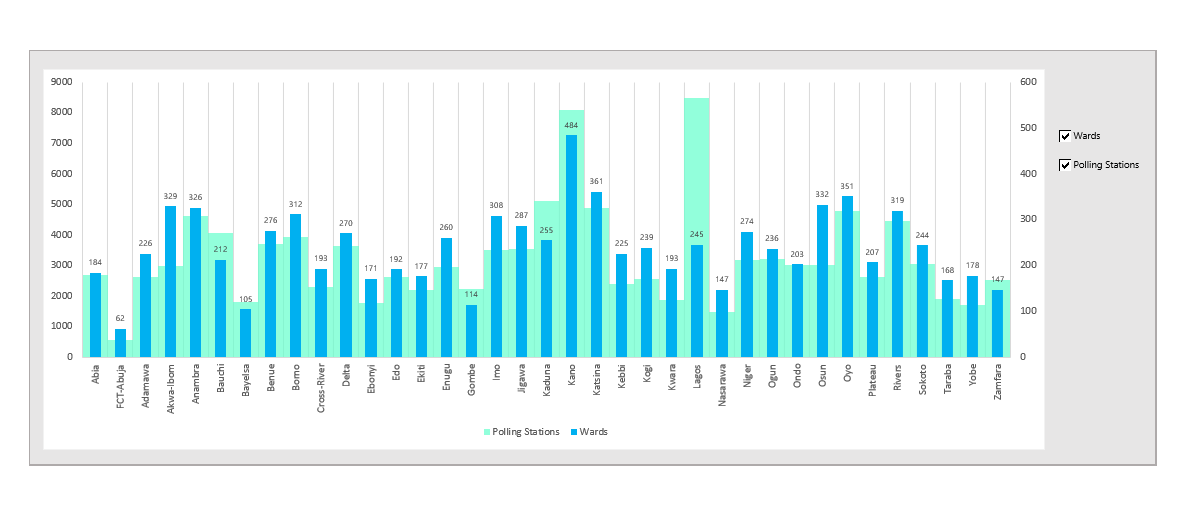
Two Form Control checkboxes on the right – Wards and Polling Stations – toggle each series on and off without touching the underlying state-by-state data.
Speedometer Chart
A speedometer chart (also called a gauge or dial chart) displays a single KPI value on a semicircular arc divided into coloured zones – typically red (poor), amber (caution) and green (target). A needle points to the current value. Excel has no native gauge type – it is built by combining a doughnut chart (for the arc and zones) with a pie chart (for the needle), then overlaying them on the same plot area. The result is one of Excel's most visually striking chart types and a perennial favourite in executive dashboards.
| Platform | Support | Note |
|---|---|---|
| Excel Desktop | Full | requires combining doughnut and pie charts |
| Excel Mobile | Partial | Displays if pre-built; no editing |
| Excel Web | Partial | Displays correctly; no editing of combined chart type |
| Google Sheets import | Breaks | doughnut/pie combination does not survive import; rebuild from scratch |
Speedometer Chart
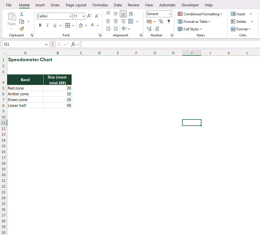
Build a data table with four rows: the three zone sizes (e.g. 33, 33, 34 for equal thirds) plus a "blank" row to create the bottom half of the doughnut arc
Insert a doughnut chart; format zone segments with red, amber and green fills; format the bottom half segment with no fill and no border
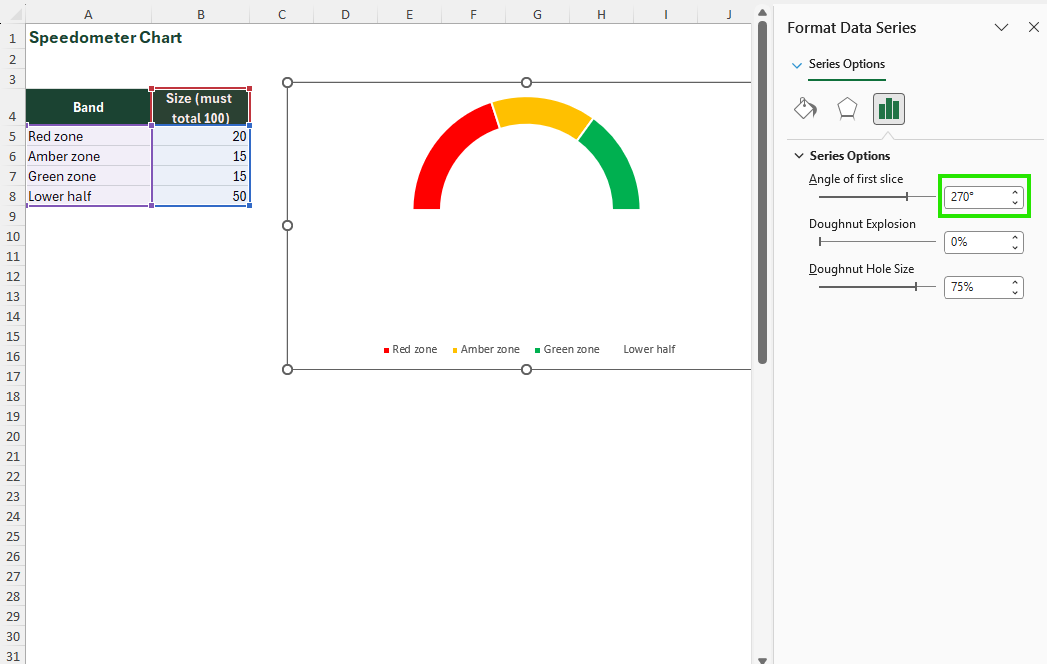
Rotate the doughnut 270° so the flat edge sits at the bottom (Format Data Series → Angle of first slice = 270)
Add a second data series (the needle): three values – needle position, needle width (1–3), and the remaining arc value; change this series type to Pie; format the needle slice with a dark fill, the others with no fill
Overlay both charts on the same plot area; lock the chart group; add a linked text box showing the numeric value beneath the dial centre
Speedometer Chart
Build a data table with four rows: the three zone sizes (e.g. 33, 33, 34 for equal thirds) plus a "blank" row to create the bottom half of the doughnut arc
Insert a doughnut chart; format zone segments with red, amber and green fills; format the bottom half segment with no fill and no border
Rotate the doughnut 270° so the flat edge sits at the bottom (Format Data Series → Angle of first slice = 270)
Add a second data series (the needle): three values – needle position, needle width (1–3), and the remaining arc value; change this series type to Pie; format the needle slice with a dark fill, the others with no fill
Overlay both charts on the same plot area; lock the chart group; add a linked text box showing the numeric value beneath the dial centre

Speedometer Chart
Build a data table with four rows: the three zone sizes (e.g. 33, 33, 34 for equal thirds) plus a "blank" row to create the bottom half of the doughnut arc
Insert a doughnut chart; format zone segments with red, amber and green fills; format the bottom half segment with no fill and no border
Rotate the doughnut 270° so the flat edge sits at the bottom (Format Data Series → Angle of first slice = 270)
Add a second data series (the needle): three values – needle position, needle width (1–3), and the remaining arc value; change this series type to Pie; format the needle slice with a dark fill, the others with no fill
Overlay both charts on the same plot area; lock the chart group; add a linked text box showing the numeric value beneath the dial centre
Speedometer Chart
Build a data table with four rows: the three zone sizes (e.g. 33, 33, 34 for equal thirds) plus a "blank" row to create the bottom half of the doughnut arc
Insert a doughnut chart; format zone segments with red, amber and green fills; format the bottom half segment with no fill and no border
Rotate the doughnut 270° so the flat edge sits at the bottom (Format Data Series → Angle of first slice = 270)
Add a second data series (the needle): three values – needle position, needle width (1–3), and the remaining arc value; change this series type to Pie; format the needle slice with a dark fill, the others with no fill
Overlay both charts on the same plot area; lock the chart group; add a linked text box showing the numeric value beneath the dial centre

Speedometer Chart
Build a data table with four rows: the three zone sizes (e.g. 33, 33, 34 for equal thirds) plus a "blank" row to create the bottom half of the doughnut arc
Insert a doughnut chart; format zone segments with red, amber and green fills; format the bottom half segment with no fill and no border
Rotate the doughnut 270° so the flat edge sits at the bottom (Format Data Series → Angle of first slice = 270)
Add a second data series (the needle): three values – needle position, needle width (1–3), and the remaining arc value; change this series type to Pie; format the needle slice with a dark fill, the others with no fill
Overlay both charts on the same plot area; lock the chart group; add a linked text box showing the numeric value beneath the dial centre

Support Team Performance Dashboard
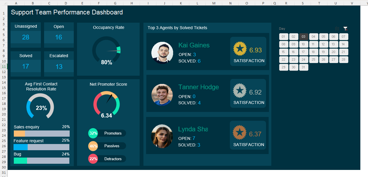
Occupancy Rate and Net Promoter Score are both built as the doughnut-plus-needle gauge this guide teaches – reused twice on the same executive dashboard.
Salesperson Scorecard
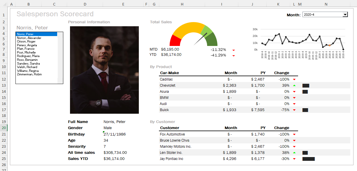
The Total Sales gauge pairs with in-cell bars in the Change column – two techniques from this guide, side by side in one scorecard.
Image Copy-Paste Chart
An image copy-paste chart (also called a picture fill chart or pictograph) is a bar or column chart where the fill of each bar is replaced by a repeated or stretched image – most often an icon, a product image or a branded graphic. This transforms a standard bar chart into a pictograph that communicates category identity through visual association, not just colour and height. It is built by copying an image to the clipboard and pasting it directly onto a selected chart bar.
| Platform | Support | Note |
|---|---|---|
| Excel Desktop | Full | paste image directly onto selected bar |
| Excel Mobile | Partial | Displays if pre-built; cannot apply picture fills on mobile |
| Excel Web | Partial | Displays but picture fills cannot be applied or edited in browser |
| Google Sheets import | Breaks | picture fills are stripped on import; bars revert to solid colour |
Image Copy-Paste Chart
Build a standard column or bar chart using your data
Prepare your images: PNG or SVG files, ideally square-format, transparent background, consistent dimensions
Copy the image to clipboard (Ctrl+C on the image file or image in a cell); click once to select the chart series, then click again to select a single bar, and paste with Ctrl+V – the image fills the bar
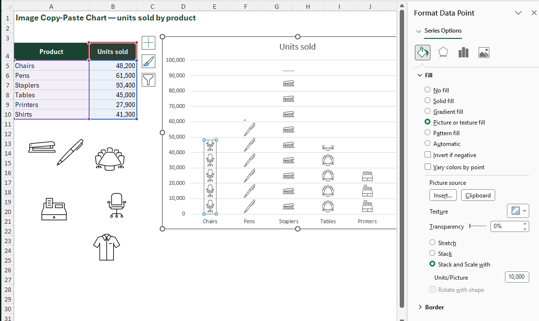
Right-click the filled bar → Format Data Series → Fill → "Stack and Scale with" → set units-per-picture to a meaningful value (e.g. 1 icon = 10,000 units); repeat for each bar if different images are needed per category
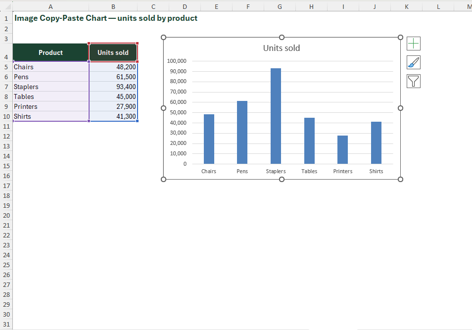
Image Copy-Paste Chart
Build a standard column or bar chart using your data
Prepare your images: PNG or SVG files, ideally square-format, transparent background, consistent dimensions
Copy the image to clipboard (Ctrl+C on the image file or image in a cell); click once to select the chart series, then click again to select a single bar, and paste with Ctrl+V – the image fills the bar
Right-click the filled bar → Format Data Series → Fill → "Stack and Scale with" → set units-per-picture to a meaningful value (e.g. 1 icon = 10,000 units); repeat for each bar if different images are needed per category
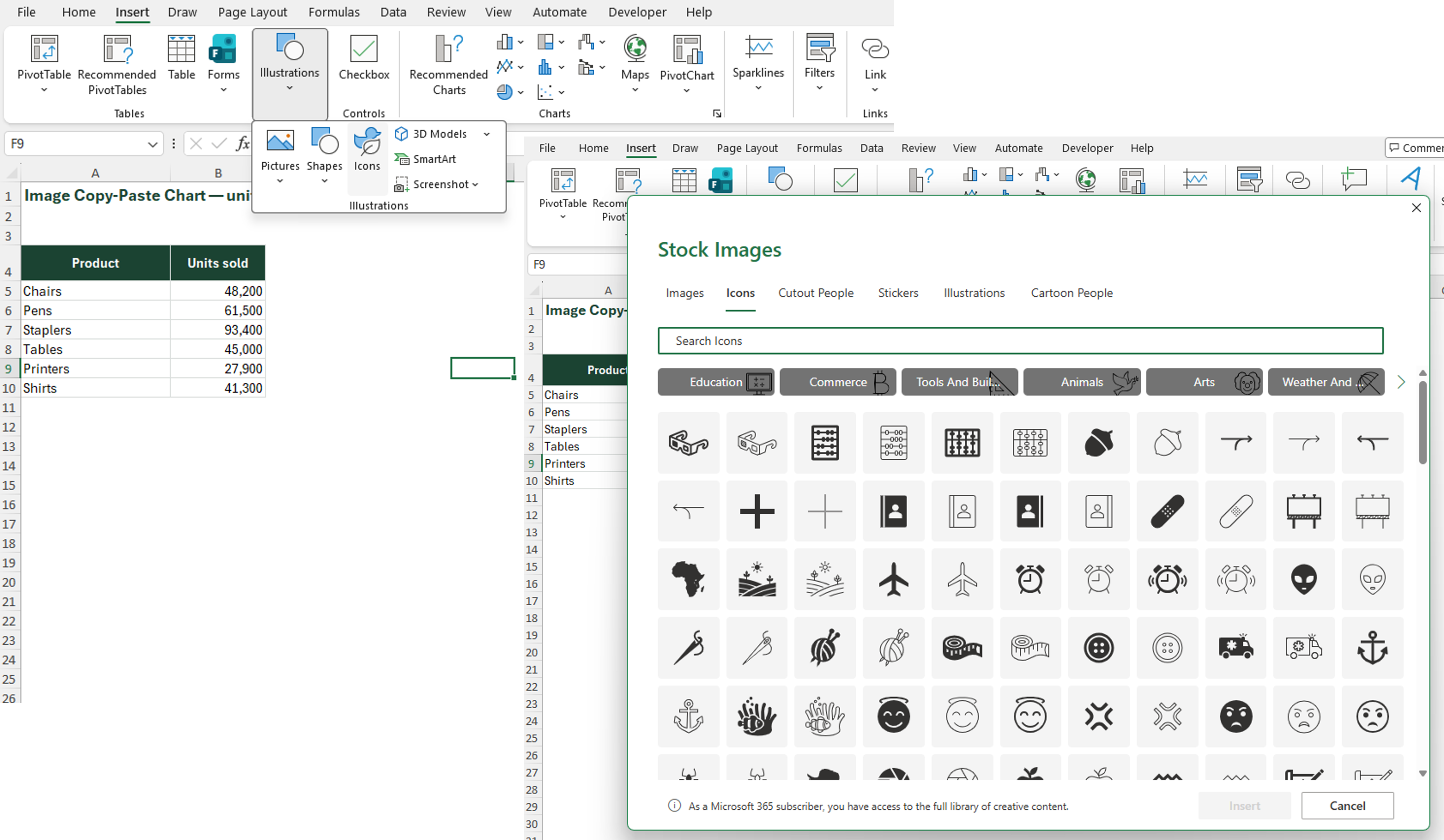
Image Copy-Paste Chart
Build a standard column or bar chart using your data
Prepare your images: PNG or SVG files, ideally square-format, transparent background, consistent dimensions
Copy the image to clipboard (Ctrl+C on the image file or image in a cell); click once to select the chart series, then click again to select a single bar, and paste with Ctrl+V – the image fills the bar
Right-click the filled bar → Format Data Series → Fill → "Stack and Scale with" → set units-per-picture to a meaningful value (e.g. 1 icon = 10,000 units); repeat for each bar if different images are needed per category
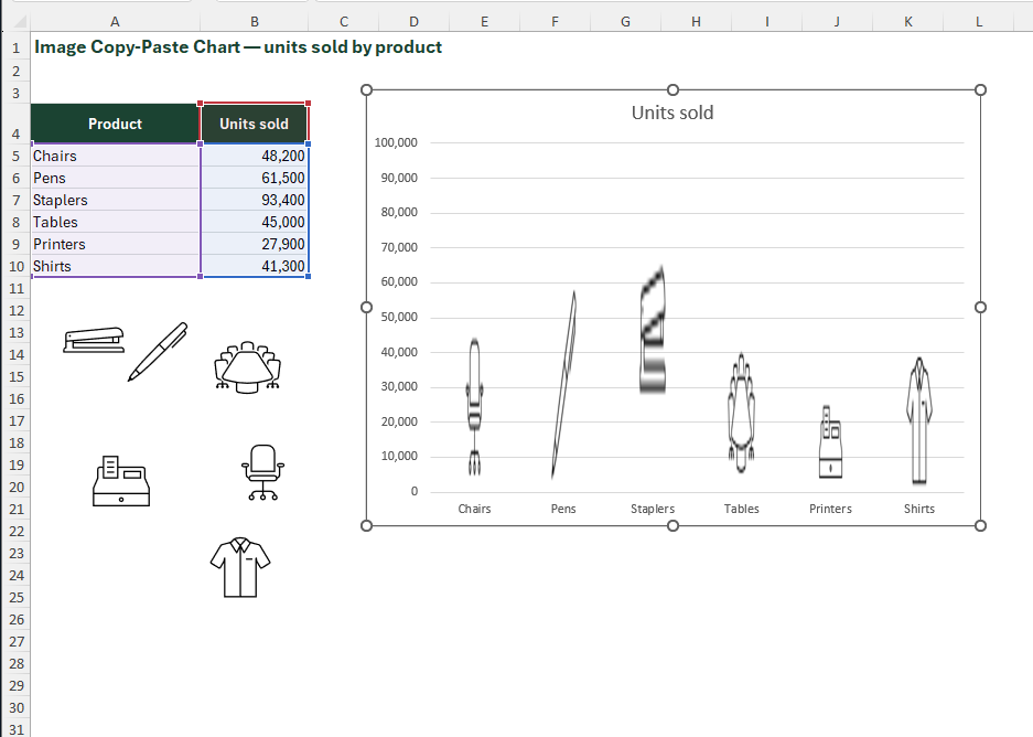
Image Copy-Paste Chart
Build a standard column or bar chart using your data
Prepare your images: PNG or SVG files, ideally square-format, transparent background, consistent dimensions
Copy the image to clipboard (Ctrl+C on the image file or image in a cell); click once to select the chart series, then click again to select a single bar, and paste with Ctrl+V – the image fills the bar
Right-click the filled bar → Format Data Series → Fill → "Stack and Scale with" → set units-per-picture to a meaningful value (e.g. 1 icon = 10,000 units); repeat for each bar if different images are needed per category
Pareto Chart
A Pareto chart combines a descending bar chart with a cumulative percentage line, built on the principle that roughly 80% of effects come from 20% of causes. Bars are sorted largest to smallest (left to right); the cumulative line rises from 0% to 100% across the bars. A reference line at 80% allows instant identification of the "vital few" categories driving the majority of the outcome. Excel 2016+ includes a native Pareto chart type.
| Platform | Support | Note |
|---|---|---|
| Excel Desktop 2016+ | Full | Insert → Charts → Histogram → Pareto |
| Excel Desktop 2013 and below | Partial | Must build manually using sorted bar chart + cumulative line series |
| Excel Mobile | Partial | View only |
| Excel Web | Full | Full support |
| Google Sheets import | Partial | reverts to bar chart; rebuild manually |
Pareto Chart
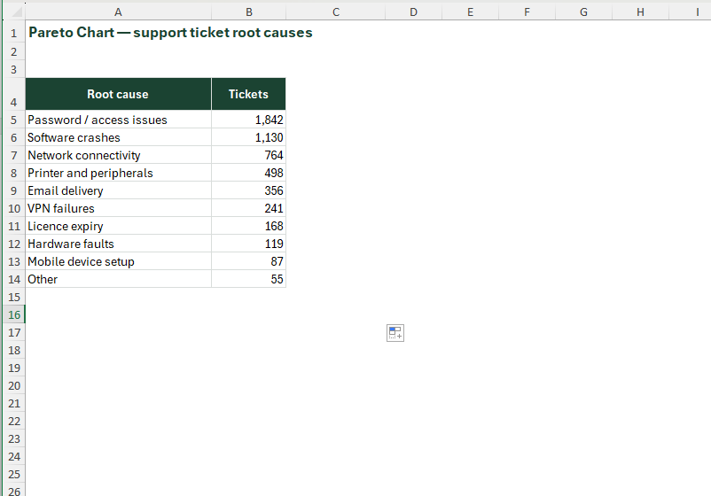
Sort your data descending by value (largest category first)
Add a helper column for cumulative %: =SUM($B$2:B2)/SUM($B$2:$B$[last row]) – format as percentage
Excel 2016+: Select both value and cumulative % columns → Insert → Charts → Histogram → Pareto – done
Format: set secondary y-axis max to 1 (100%); add a constant series at 0.8 as a dashed horizontal reference line; label the 80% line; set bar colours descending dark-to-light green; format line with red
Pareto Chart
Sort your data descending by value (largest category first)
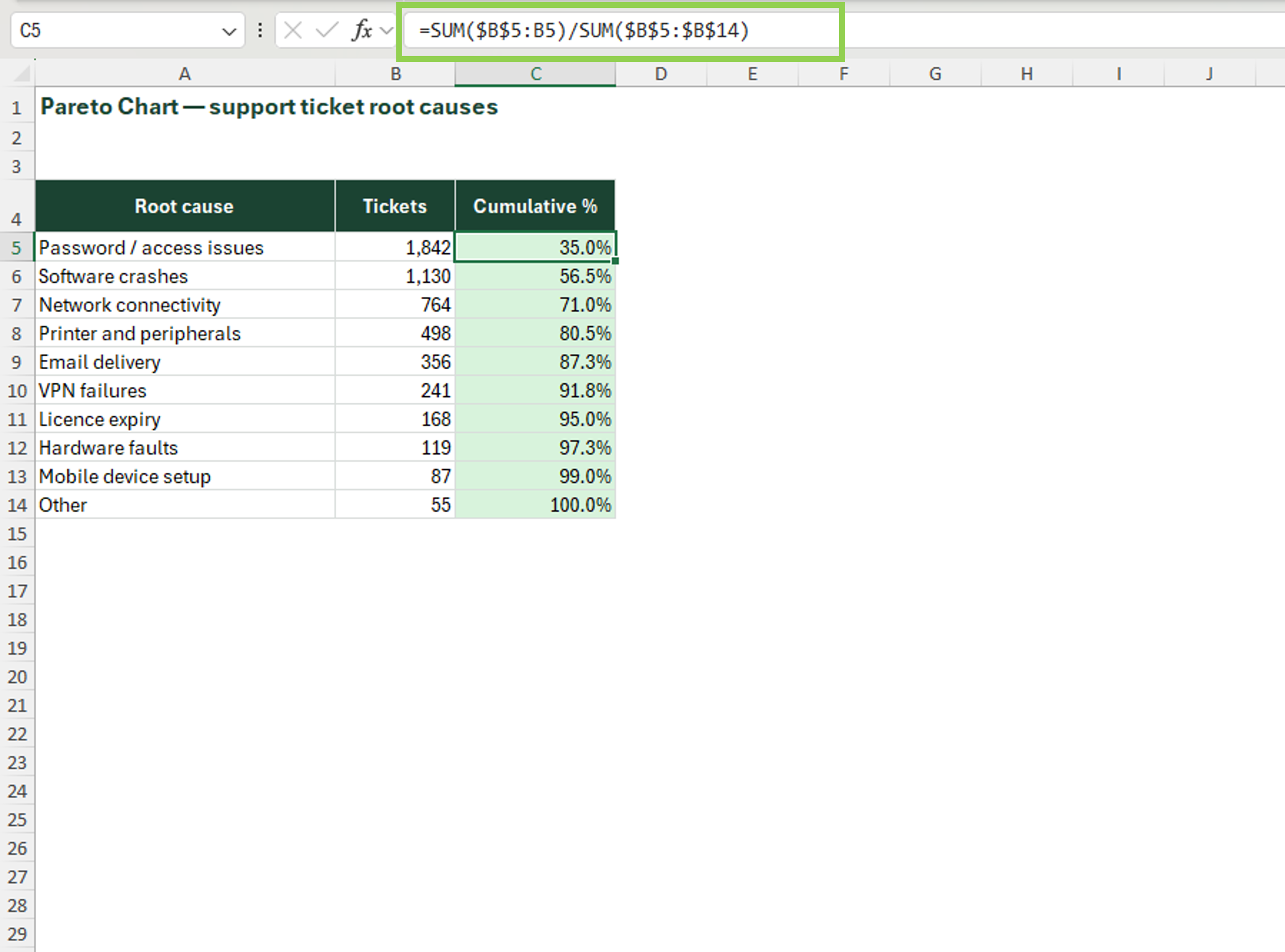
Add a helper column for cumulative %: =SUM($B$2:B2)/SUM($B$2:$B$[last row]) – format as percentage
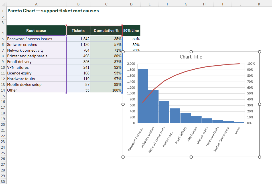
Excel 2016+: Select both value and cumulative % columns → Insert → Charts → Histogram → Pareto – done
Format: set secondary y-axis max to 1 (100%); add a constant series at 0.8 as a dashed horizontal reference line; label the 80% line; set bar colours descending dark-to-light green; format line with red
Pareto Chart
Sort your data descending by value (largest category first)
Add a helper column for cumulative %: =SUM($B$2:B2)/SUM($B$2:$B$[last row]) – format as percentage
Excel 2016+: Select both value and cumulative % columns → Insert → Charts → Histogram → Pareto – done
Format: set secondary y-axis max to 1 (100%); add a constant series at 0.8 as a dashed horizontal reference line; label the 80% line; set bar colours descending dark-to-light green; format line with red
Pareto Chart
Sort your data descending by value (largest category first)
Add a helper column for cumulative %: =SUM($B$2:B2)/SUM($B$2:$B$[last row]) – format as percentage
Excel 2016+: Select both value and cumulative % columns → Insert → Charts → Histogram → Pareto – done
Format: set secondary y-axis max to 1 (100%); add a constant series at 0.8 as a dashed horizontal reference line; label the 80% line; set bar colours descending dark-to-light green; format line with red

All eleven charts, side by side
| Complexity | Compatibility | |||||||||||
|---|---|---|---|---|---|---|---|---|---|---|---|---|
| Chart | Level | Features | Format | Formulas | Controls | Time | Desktop | Web | Mobile | Sheets | ||
| 01 | Combo ChartTwo scales, one plot area | Beginner | Full | Full | Partial | Partial | ||||||
| 02 | Funnel ChartStage-by-stage drop-off | Beginner | Full | Full | Partial | Breaks | ||||||
| 03 | In-Cell ChartCharts that live inside cells | Beginner | Full | Partial | Partial | Breaks | ||||||
| 04 | Waterfall ChartShow cumulative change across categories | Intermediate | Full | Full | Partial | Breaks | ||||||
| 05 | Gantt ChartTasks laid out along a timeline | Intermediate | Full | Full | Partial | Breaks | ||||||
| 06 | Waffle ChartA 10x10 grid as a percentage | Intermediate | Full | Full | Partial | Partial | ||||||
All eleven charts, side by side
| Complexity | Compatibility | |||||||||||
|---|---|---|---|---|---|---|---|---|---|---|---|---|
| Chart | Level | Features | Format | Formulas | Controls | Time | Desktop | Web | Mobile | Sheets | ||
| 07 | Butterfly ChartTwo populations, mirrored | Intermediate | Full | Full | Partial | Partial | ||||||
| 08 | Checkbox ChartReader-controlled series toggles | Intermediate | Full | Partial | Partial | Breaks | ||||||
| 09 | Speedometer ChartA dial for a single metric | Advanced | Full | Partial | Partial | Breaks | ||||||
| 10 | Image Copy-Paste ChartBars filled with pictures | Advanced | Full | Partial | Partial | Breaks | ||||||
| 11 | Pareto ChartFind the vital few | Intermediate | Full | Full | Partial | Partial | ||||||
Beyond the
Bar Chart.
11 underused chart types that transform how your dashboards, models and reports communicate.
You just built eleven charts.
Here is what to build next.
This guide is one corner of the site. Everything below is already there, free or paid, and all of it is built the same way: native Excel, no add-ins, workbook included.


