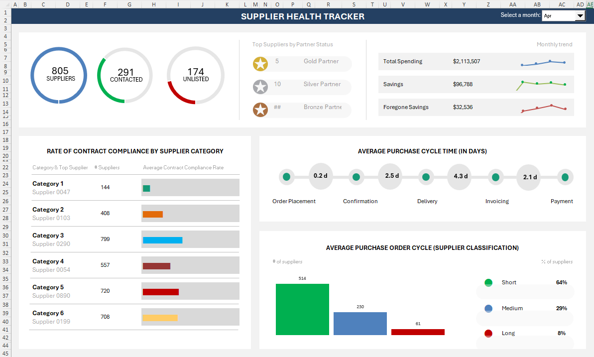
Free · PDF, interactive guide and workbook

    Beyond the Bar Chart

    11 underused Excel chart types that transform how your dashboards communicate.

    Most Excel dashboards tell the truth. They just don’t tell it well. This is a step-by-step visual guide for finance, operations and analytics professionals — every chart with real enterprise use cases, a complexity scorecard and a screenshot-led build walkthrough.

    No email required No macros to enable Excel 2016 and later

    Inside the guide

    • Combo
    • Funnel
    • In-Cell
    • Waterfall
    • Gantt
    • Waffle
    • Butterfly
    • Checkbox
    • Speedometer
    • Image Copy-Paste
    • Pareto
    chart types
    11chart types
    build steps
    52build steps
    use cases
    55use cases
    Why this guide exists

    A bar chart is honest. Familiar is not the same as effective.

    A pie chart is familiar. A clustered column is safe. But in a world where your audience is overloaded, a chart that is merely accurate is not enough — it needs to stop the scroll, hold attention, and make the insight impossible to miss.

    Excel, the tool already sitting on every desk in your organisation, hides one of the most powerful data visualisation toolkits in the world. Not in a plugin. Not behind a paywall. Right there, beneath the surface of Insert → Charts.

    Bar charts inform. These charts convince, clarify and captivate.

    The eleven charts

    Every chart type, sequenced simplest to hardest

    3 beginner, 6 intermediate and 2 advanced builds. Open any chart to see its enterprise use cases, complexity scorecard, build steps and the one pro tip that saves the most time.

    01Beginner

    Combo Chart

    Two scales, one plot area

    A combo chart overlays two different chart types on the same plot area — most commonly a column chart and a line chart — each mapped to its own axis. It solves one of the most common dashboard problems: showing two datasets that live on fundamentally different scales in the same visual space.

    Where it earns its place

    • Revenue and margin dashboard · Finance & Accounting
    • Sales and headcount reporting · Sales & Revenue
    • Inventory and demand planning · Supply Chain & Operations
    • Budget vs actuals reporting · Finance & Accounting
    • Customer acquisition and churn · Marketing & Growth

    Complexity scorecard

    Features
    Formatting
    Formulas
    Controls
    Time

    Build steps in the guide

    1. 01Insert a clustered column chart
    2. 02Change one series to a line
    3. 03Set the line series to Line
    4. 04Send the line to a secondary axis
    5. 05Calibrate axes and clean up formatting

    Pro tip · Set the secondary axis maximum to roughly double your line's peak value. It keeps the line clear of the columns instead of cutting through them.

    VBA required: No. Built entirely with native Excel chart tools.
    02Beginner

    Funnel Chart

    Stage-by-stage drop-off

    A funnel chart shows values progressively decreasing across sequential stages — visualising drop-off, conversion, or attrition through a process. Each bar is centred and narrower than the one above, creating a distinctive funnel silhouette that makes the relative size of each stage immediately legible.

    Where it earns its place

    • Sales pipeline · Sales & Revenue
    • Recruitment funnel · HR & People
    • Customer onboarding · Customer Support & Success
    • Budget approval pipeline · Finance & Accounting
    • Website conversion · Marketing & Growth

    Complexity scorecard

    Features
    Formatting
    Formulas
    Controls
    Time

    Build steps in the guide

    1. 01Insert the native funnel chart
    2. 02Tighten gap width, remove chrome
    3. 03Apply a top-to-bottom colour ramp

    Pro tip · Excel gives you no conversion-rate labels. Add a helper column of stage-over-stage percentages and link each data label to it with "Value From Cells".

    VBA required: No.

    03Beginner

    In-Cell Chart

    Charts that live inside cells

    In-cell charts are micro-visualisations that live inside spreadsheet cells rather than as separate chart objects. They take two forms: Excel's native Sparklines (miniature line, bar or win/loss charts embedded in a cell), and REPT-function bar charts (a formula-driven technique that fills a cell with repeated characters scaled to a value). Both allow data tables to carry their own visual context without a separate chart object.

    Where it earns its place

    • KPI scorecards · Executive & Strategy
    • League tables and rankings · Sales & Revenue
    • Financial model summaries · Finance & Accounting
    • HR dashboards · HR & People
    • Operational monitoring · Supply Chain & Operations

    Complexity scorecard

    Features
    Formatting
    Formulas
    Controls
    Time

    Build steps in the guide

    1. 01Insert a sparkline beside your data
    2. 02Style high, low and marker points
    3. 03Build a REPT bar in Playbill
    4. 04Adjust the divisor to control bar length
    5. 05Colour-code bars by value band

    Pro tip · REPT bars only line up if every cell in the column uses the same font. Set it to Playbill before you build, not after.

    VBA required: No.

    04Intermediate

    Waterfall Chart

    Show cumulative change across categories

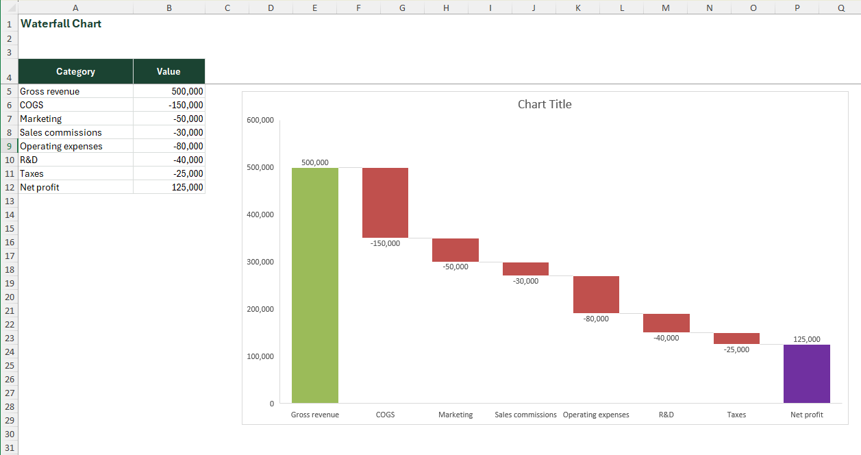
    A waterfall chart visualises how an initial value is built up or broken down by a series of intermediate positive and negative contributions, arriving at a final total. Bars float at heights corresponding to cumulative running totals — each bar's top marks where the next bar begins — making the path from start to finish immediately readable. It is one of the most analytically powerful chart types in business reporting and one of the most underused.

    Where it earns its place

    • P&L bridge · Finance & Accounting
    • Inventory stock movement · Supply Chain & Operations
    • Cash flow reconciliation · Finance & Accounting
    • Headcount movement · HR & People
    • Revenue attribution · Sales & Revenue

    Complexity scorecard

    Features
    Formatting
    Formulas
    Controls
    Time

    Build steps in the guide

    1. 01Build a three-column data table
    2. 02Insert the waterfall chart
    3. 03Mark opening and closing bars as totals
    4. 04Remove gridlines

    Pro tip · In Excel 2013 or earlier, recreate this with a stacked bar plus an invisible base series — set the base fill to "No Fill, No Border" to make the bars float.

    VBA required: No.

    05Intermediate

    Gantt Chart

    Tasks laid out along a timeline

    A Gantt chart is a horizontal bar chart where each bar represents a task or phase, positioned along a timeline. Its x-axis is time; its y-axis is a list of activities. Bars begin at the task start date and end at the task end date. Excel has no native Gantt chart type — it is built by combining a stacked bar chart with an invisible start-date series, producing one of Excel's most valued dashboard constructs.

    Where it earns its place

    • Project planning · Project & PMO
    • Monthly close schedule · Finance & Accounting
    • Audit planning · Finance & Accounting
    • Product roadmap · Project & PMO
    • Resource planning · HR & People

    Complexity scorecard

    Features
    Formatting
    Formulas
    Controls
    Time

    Build steps in the guide

    1. 01Build a task, start date and duration table
    2. 02Insert a stacked bar chart
    3. 03Make the start-date series invisible
    4. 04Reverse the category axis order
    5. 05Fix the date axis bounds and format

    Pro tip · Reversing the category axis is the step everyone forgets. Without it your first task sits at the bottom and the whole schedule reads upside down.

    VBA required: Optional. A basic Gantt works without VBA. For dynamic Gantts with automated "today" line, progress shading, or dropdown-driven filtering, VBA or named range formulas are needed.

    06Intermediate

    Waffle Chart

    A 10x10 grid as a percentage

    A waffle chart is a 10×10 grid of equal squares where each square represents 1% of a total. Filled squares (typically coloured) show the actual percentage; unfilled squares show the remainder. It is a visually compelling alternative to a pie or donut chart for single-percentage KPIs — more precise, more readable, and significantly more striking in a dashboard layout.

    Where it earns its place

    • KPI completion rate · Executive & Strategy
    • Market share visualisation · Marketing & Growth
    • Survey or NPS results · Customer Support & Success
    • Headcount diversity metrics · HR & People
    • Capacity utilisation · Supply Chain & Operations

    Complexity scorecard

    Features
    Formatting
    Formulas
    Controls
    Time

    Build steps in the guide

    1. 01Build a square 10x10 cell grid
    2. 02Number the cells 1 to 100
    3. 03Write the percentage helper formula
    4. 04Apply the conditional formatting rule
    5. 05Hide the numbers and add a label

    Pro tip · Make the 10x10 block genuinely square before you format it. Set both row height and column width by pixel, or your percentage reads as a distorted rectangle.

    VBA required: No. Built using conditional formatting and a supporting percentage formula in a helper cell.

    07Intermediate

    Butterfly Chart

    Two populations, mirrored

    A butterfly chart (also called a tornado chart or back-to-back bar chart) displays two datasets horizontally on either side of a central axis, with categories shared between them. Left bars extend leftward; right bars extend rightward. It excels at head-to-head comparisons — making differences and similarities across a shared category list instantly readable.

    Where it earns its place

    • Demographic analysis · HR & People
    • Competitor benchmarking · Marketing & Growth
    • Before and after comparison · Project & PMO
    • Survey response comparison · Customer Support & Success
    • Budget vs actuals by department · Finance & Accounting

    Complexity scorecard

    Features
    Formatting
    Formulas
    Controls
    Time

    Build steps in the guide

    1. 01Negate one side in a helper column
    2. 02Insert a bar chart from both series
    3. 03Overlap the series to 100%
    4. 04Hide the minus signs with a number format
    5. 05Centre the category labels between wings

    Pro tip · Negate one side with a helper column, then use a custom number format such as 0;0 so the axis and labels still read as positive values.

    VBA required: No.

    08Intermediate

    Checkbox Chart

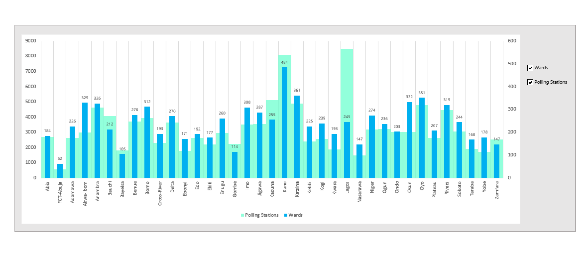
    Reader-controlled series toggles

    A checkbox chart is a standard chart (column, line, bar or other) connected to a set of Form Control checkboxes that show or hide individual data series dynamically. Checking a box makes a series visible; unchecking hides it. The result is an interactive dashboard element that allows users to control what they see without editing the underlying data — a powerful UX upgrade for shared reports and presentations.

    Where it earns its place

    • Multi-region sales dashboard · Sales & Revenue
    • Scenario comparison model · Finance & Accounting
    • Product line performance · Marketing & Growth
    • Departmental cost dashboard · Finance & Accounting
    • Executive presentation charts · Executive & Strategy

    Complexity scorecard

    Features
    Formatting
    Formulas
    Controls
    Time

    Build steps in the guide

    1. 01Write the IF/NA toggle formulas
    2. 02Add Form Control checkboxes
    3. 03Link each checkbox to a cell
    4. 04Chart the toggled helper range
    5. 05Position the controls over the chart

    Pro tip · Return NA() rather than 0 from your toggle formula. A zero flattens the series onto the axis; NA() removes it from the plot entirely.

    VBA required: No. Uses Form Control checkboxes linked to helper cells, combined with IF-based series toggle formulas. (VBA can be added for more advanced reset/select-all functionality.)

    09Advanced

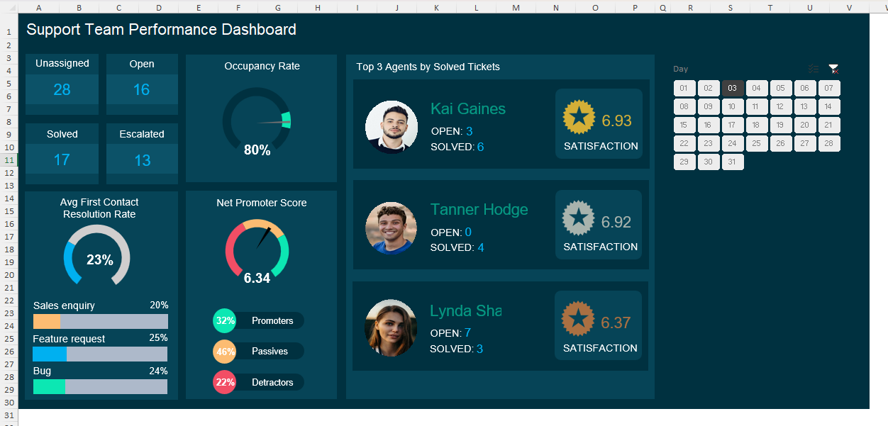
    Speedometer Chart

    A dial for a single metric

    A speedometer chart (also called a gauge or dial chart) displays a single KPI value on a semicircular arc divided into coloured zones — typically red (poor), amber (caution) and green (target). A needle points to the current value. Excel has no native gauge type — it is built by combining a doughnut chart (for the arc and zones) with a pie chart (for the needle), then overlaying them on the same plot area. The result is one of Excel's most visually striking chart types and a perennial favourite in executive dashboards.

    Where it earns its place

    • KPI dashboard headline metric · Executive & Strategy
    • Sales target attainment · Sales & Revenue
    • Financial health indicator · Finance & Accounting
    • Operational SLA compliance · Customer Support & Success
    • Safety and quality metrics · Supply Chain & Operations

    Complexity scorecard

    Features
    Formatting
    Formulas
    Controls
    Time

    Build steps in the guide

    1. 01Build the band and needle data table
    2. 02Insert a doughnut chart for the bands
    3. 03Rotate and hide the lower half
    4. 04Add the needle as a second series
    5. 05Overlay the value and finish the dial

    Pro tip · The needle is a second doughnut ring, not a shape. Build it as three slices — before, needle, after — so it rotates with the value instead of needing to be dragged.

    VBA required: Optional for static gauge. Required for a dynamic needle that updates live when a linked cell changes without requiring a chart refresh.

    10Advanced

    Image Copy-Paste Chart

    Bars filled with pictures

    An image copy-paste chart (also called a picture fill chart or pictograph) is a bar or column chart where the fill of each bar is replaced by a repeated or stretched image — most often an icon, a product image or a branded graphic. This transforms a standard bar chart into a pictograph that communicates category identity through visual association, not just colour and height. It is built by copying an image to the clipboard and pasting it directly onto a selected chart bar.

    Where it earns its place

    • Product comparison charts · Marketing & Growth
    • Regional sales dashboards · Sales & Revenue
    • HR and people analytics · HR & People
    • Retail and FMCG reporting · Supply Chain & Operations
    • Executive presentations · Executive & Strategy

    Complexity scorecard

    Features
    Formatting
    Formulas
    Controls
    Time

    Build steps in the guide

    1. 01Build a standard column chart
    2. 02Prepare square, transparent icons
    3. 03Copy an icon to the clipboard
    4. 04Select one bar and paste the fill
    5. 05Switch to Stack and Scale units

    Pro tip · Always choose "Stack and Scale with" over "Stretch". Stretch distorts your icon every time the underlying value changes.

    VBA required: No.

    11Intermediate

    Pareto Chart

    Find the vital few

    A Pareto chart combines a descending bar chart with a cumulative percentage line, built on the principle that roughly 80% of effects come from 20% of causes. Bars are sorted largest to smallest (left to right); the cumulative line rises from 0% to 100% across the bars. A reference line at 80% allows instant identification of the "vital few" categories driving the majority of the outcome. Excel 2016+ includes a native Pareto chart type.

    Where it earns its place

    • Defect and quality analysis · IT & Quality
    • Customer complaint analysis · Customer Support & Success
    • Revenue concentration analysis · Finance & Accounting
    • Cost driver analysis · Finance & Accounting
    • IT incident management · IT & Quality

    Complexity scorecard

    Features
    Formatting
    Formulas
    Controls
    Time

    Build steps in the guide

    1. 01Sort categories descending by value
    2. 02Add the cumulative percentage column
    3. 03Insert the native Pareto chart
    4. 04Or build it manually as a combo
    5. 05Lock the axis and add the 80% line

    Pro tip · Excel defaults the cumulative axis to 0-120%. Lock the maximum to 1 or the 80% line lands in the wrong place and the chart lies.

    VBA required: No.

    How the guide is built

    Three sections per chart — every time

    The structure never changes, so once you have read one chart you know exactly where to find what you need in the other ten.

    01

    Overview

    What the chart is, when to reach for it, five real enterprise use cases tagged by business function, platform-by-platform compatibility across Excel Desktop, Mobile, Web and Google Sheets, and whether VBA is required.

    02

    Complexity scorecard

    A five-dimension rating — features needed, formatting effort, formulas required, form controls used and time to develop — plus the constraints and limitations that bite once you are halfway through the build.

    03

    Build steps

    A numbered, screenshot-supported walkthrough from a blank sheet to a finished chart. Charts are sequenced simplest to most complex, so early wins build the confidence the advanced builds need.

    What you will build

    Excel dashboard visualisations, built from scratch

    Every chart below is native Excel — no add-ins, no Power BI, no external tools. These are screenshots of the finished builds the guide walks you through.

    Excel dashboard showing a speedometer gauge chart built from a doughnut and pie chart combination, with red, amber and green performance bands
    Speedometer chart — doughnut bands plus a pie-slice needle
    Excel dashboard using in-cell sparklines and REPT bar charts inside a KPI scorecard table
    In-cell charts — sparklines and REPT bars inside the table
    Interactive Excel dashboard chart with Form Control checkboxes toggling individual data series on and off
    Checkbox chart — Form Controls toggling series on and off
    Excel waterfall chart showing a profit and loss bridge from gross revenue down to net profit through floating deduction bars
    Waterfall chart — a P&L bridge from revenue to net profit
    Who it is for

    Written for people whose charts have to land

    Every use case in the guide is tagged by business function, so you can jump straight to the charts that fit the reporting you actually produce.

    Finance and FP&A

    You build the board pack. A waterfall turns a variance table into a story a CFO reads in three seconds, and a Pareto shows which cost lines are actually worth the meeting.

    • Waterfall
    • Pareto
    • Combo

    Operations and supply chain

    Stock movement, capacity, throughput and SLA attainment all have a natural shape. In-cell charts compress a dense operational table; the speedometer puts one number where leadership will look first.

    • In-Cell
    • Speedometer
    • Waterfall

    Analysts and BI builders

    You already know the theory. What you want is the Excel mechanics — the invisible spacer series, the NA() toggle, the doughnut-plus-pie needle — written down once so you stop rediscovering them.

    • Gantt
    • Checkbox
    • Butterfly

    Project and PMO leads

    Excel has no Gantt chart type. It has something better: a stacked bar you control completely. Build a schedule that updates from real dates instead of fighting a project tool licence.

    • Gantt
    • Waffle
    • Checkbox

    HR and people analytics

    Headcount movement, attrition and demographic splits read badly as tables. A butterfly chart makes a population pyramid legible; a waterfall shows exactly where people joined and left.

    • Butterfly
    • Waterfall
    • Waffle

    Consultants and client-facing teams

    Your deliverable is the deck. Picture-fill bars and a well-built dial carry brand and category identity in a way a default Excel blue column chart never will.

    • Image Fill
    • Speedometer
    • Funnel
    Three ways to use it

    Read it, link it, or build along in the workbook

    The PDF

    A4 landscape, designed for reading on screen and printing for the desk. The full guide, cover to cover.

    Download the PDF

    The interactive guide

    The same book online, with fast navigation and deep links — send a colleague straight to the chart they need.

    Open the guide

    The workbook

    A companion .xlsx with a worked version of each chart, so you can inspect the data tables, helper columns and series settings.

    Download the workbook
    Questions

    Before you download

    Which Excel version do I need for these chart types?

    Most of the eleven charts work in Excel 2016 and later. Waterfall and Pareto became native chart types in Excel 2016; the funnel chart arrived in 2019. Every chart in the guide lists its compatibility across Excel Desktop, Excel Mobile, Excel Web and Google Sheets, and gives a manual workaround where a version lacks the native type — for example simulating a funnel with a centre-aligned stacked bar in Excel 2016.

    Do any of these Excel charts require VBA or macros?

    No. Every chart in the guide is built with native Excel features — chart types, formatting, formulas, conditional formatting and Form Controls. VBA is noted as optional in two places only: a Gantt chart with an automated "today" line, and a speedometer with a live-updating needle. The core builds are all macro-free, so the workbooks open without security warnings.

    Is Beyond the Bar Chart really free?

    Yes. The PDF, the interactive online version and the companion workbook are all free to download, with no email required. It is published by 101 Excel Hacks as a reference for finance, operations and analytics professionals.

    What is the difference between the PDF and the interactive version?

    The content is identical — both are generated from the same source. The PDF is laid out A4 landscape for reading and printing. The interactive HTML version adds fast navigation and deep links, so you can send a colleague straight to the waterfall build steps rather than telling them to scroll to a page number.

    Which Excel chart should I use for my dashboard?

    Choose based on the question, not the data. For change across a sequence of drivers use a waterfall. For drop-off through stages use a funnel. For a single KPI against a target use a speedometer or a waffle. For two series on different scales use a combo. For finding the vital few causes use a Pareto. For a schedule use a Gantt. The guide gives five enterprise use cases per chart, tagged by business function, precisely so you can match the chart to your reporting question.

    Can I use these charts in a client or board presentation?

    Yes — that is what they are designed for. The guide covers picture-fill bars for branded decks, interactive checkbox charts for live walkthroughs, and speedometer dials for executive summary pages, including the print and file-size constraints that matter once a chart leaves your screen.

    Does the guide include practice files?

    Yes. A companion Excel workbook accompanies the guide with a worked version of each chart, so you can inspect the underlying data tables, helper columns and series settings rather than rebuilding from a screenshot.

    Build something worth looking at

    Eleven chart types most Excel users will never attempt. Free, no email required, and yours to keep.

    Looking for more? Browse every free resource.

    Ask AI