Gauge charts are visualization tools used to show a KPI performance in relation to a gradient demonstrating the ranges of poor, medium, average, and excellent performance.
Gauge charts have a reputation for being more aesthetic than functional for data visualization purposes. Some don’t think they deliver that much punch compared to the real estate they take up on dashboards. But still, gauge charts remain popular, likely due to their simplicity and ease of interpretation.
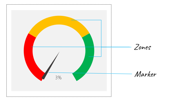
Gauge charts are comprised of two key components – zones and a marker. The zones communicate the range of performance which depending on the KPI in view can take different variants. For instance, a 2-zone chart may communicate Good-Bad, a 3-zone chart Poor-Average-Excellent, a 5-zone chart could be used to indicate Low-Below Average-Average-Above Average-Excellent, and so on. The zones are usually differentiated by their colors.

You can set up gauge charts based on your specific KPI profile, and create dynamic markers that update when the KPI value changes

Here’s how to set up a dynamic gauge chart.
Step 1: Define the zones of performance of your KPI. This could be 2, 3, 5, or more per the zone descriptions above. For my example, I’m using a 3-zone range: Poor, Average, and Excellent performance. Also, indicate the numeric ranges of the zones, for instance, 0-30% is Poor performance for my KPI, 31-70% is Average performance, etc.
Also, set up a new table that accounts for a buffer and the absolute range of each zone. What this means is that since zone 1 (Poor) is from 0-30, the absolute range is 30. Zone 2 (Average) is from 31-70 so the absolute range is 40. And so on and so forth. The value for the buffer area will be 20. As we are working with percentages, the total value for the Zones must add up to 100.

Step 2: Create a new doughnut chart with the entire range of zone values plus buffer value (C31:C34)

Right-click the chart and select “Format Data Series”…

…update the Angle of first slice to 150 degrees, so the buffer area (blue area) is positioned at the bottom, the way a traditional speedometer is set up.

Next, update the fill color of the pie chart segments as shown below: no fill for the buffer area, red fill for Zone 1, orange for Zone 2, and green for Zone 3. With this, the Zone section of the gauge chart is now set up.
Step 2: Create a second data table for the marker (which is also a stylized pie chart). This table will have 4 records: KPI Value representing the position of the marker, Buffer 1 for the area before the marker, Marker size for the chart segment representing the marker, and Buffer 2 for the area representing the rest of the chart region. The values for Buffer 1 and Buffer 2 will be computed based on the value in KPI Value, while Marker size will be a fixed number – 5. I’ve described the logic behind the formulas for Buffer 1 and Buffer 2 below:

Create a new regular pie chart using the values in the second data table. Remove the extraneous chart details – chart title and legend. Make the angle of the first slice 180 degrees, and change the fill color for Buffer 1 and Buffer 2 to no fill, Marker size to black fill.
Now, arrange the two charts so that they are perfectly layered over each other. Create a dynamic label by inserting a textbox shape, and linking the shape to the KPI Value. And your gauge chart is fully set up for use.