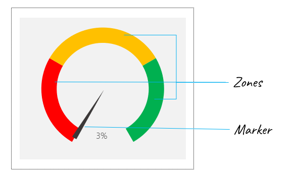
Excel Hack 88: Create dynamic gauge charts with 3 zones in Microsoft Excel
Gauge charts are visualization tools used to show a KPI performance in relation to a gradient demonstrating the ranges of poor, medium, average, and excellent performance. Gauge charts have a reputation for being more aesthetic than functional for data visualization purposes. Some don’t think they deliver that much punch compared to the real estate they