I came across an interactive chart in a company training material similar to the one in the snapshot sometime ago, and I remember wondering how it was built for a while. The chart has a feature that enables the user to adjust the number of series that are visible on the chart at any given time by selecting or deselecting check boxes attached to all the series on the chart. I was finally able to figure out how to create a similar chart effect using a combination of check boxes and conditional formatting.

Step 1: Prepare your standard table with values as shown below

Step 2: Prepare another table using your column and row headers. This is where the chart will read from.
Step 3: Place 5 check boxes (File>Developer>Insert>Checkbox) on the sheet and link them one after the other to the cells directly above the headers of the new table, as shown below. Remove the text associated with the check boxes so that only the box is visible.

Step 4: Fill the new table with values using the formula highlighted in the snapshot below. This formula asks Excel to return the corresponding value from the first table if the checkbox is ticked (cell link is TRUE) but return an error value (#N/A) if it is not ticked (cell link is FALSE).

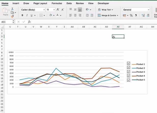
Step 5: Group the check boxes and fit them close to the chart (that has been prepared from the 2nd table) so that they correspond to the series they are linked to.
The chart is now complete